The
FADER
Creative Direction for The FADER - magazine, website, and beyond.
As Creative Director of The FADER, I was the first creative lead that was brought on with the specific mandate to think of the property beyond its individual silos - the magazine, the website/blog, the events... and think of it as a holistic brand. Previously the brands activities were disparate and not cohesive, and under my direction we created a strong overall brand voice that leveraged its well respected history while also pushing ideas forward (as is the spirit of The FADER). All while understanding the importance of the printed product which stands nearly alone in what was previously as crowded universe of print music journalism.
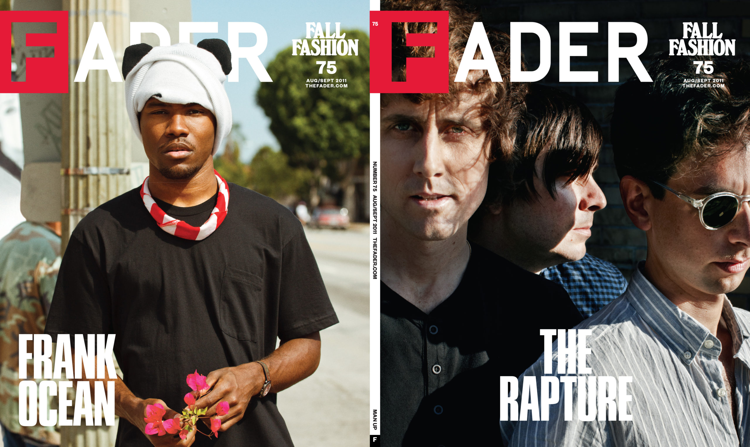
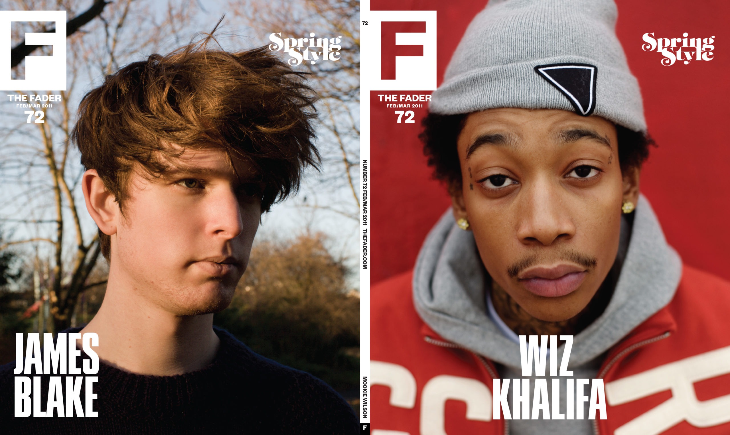
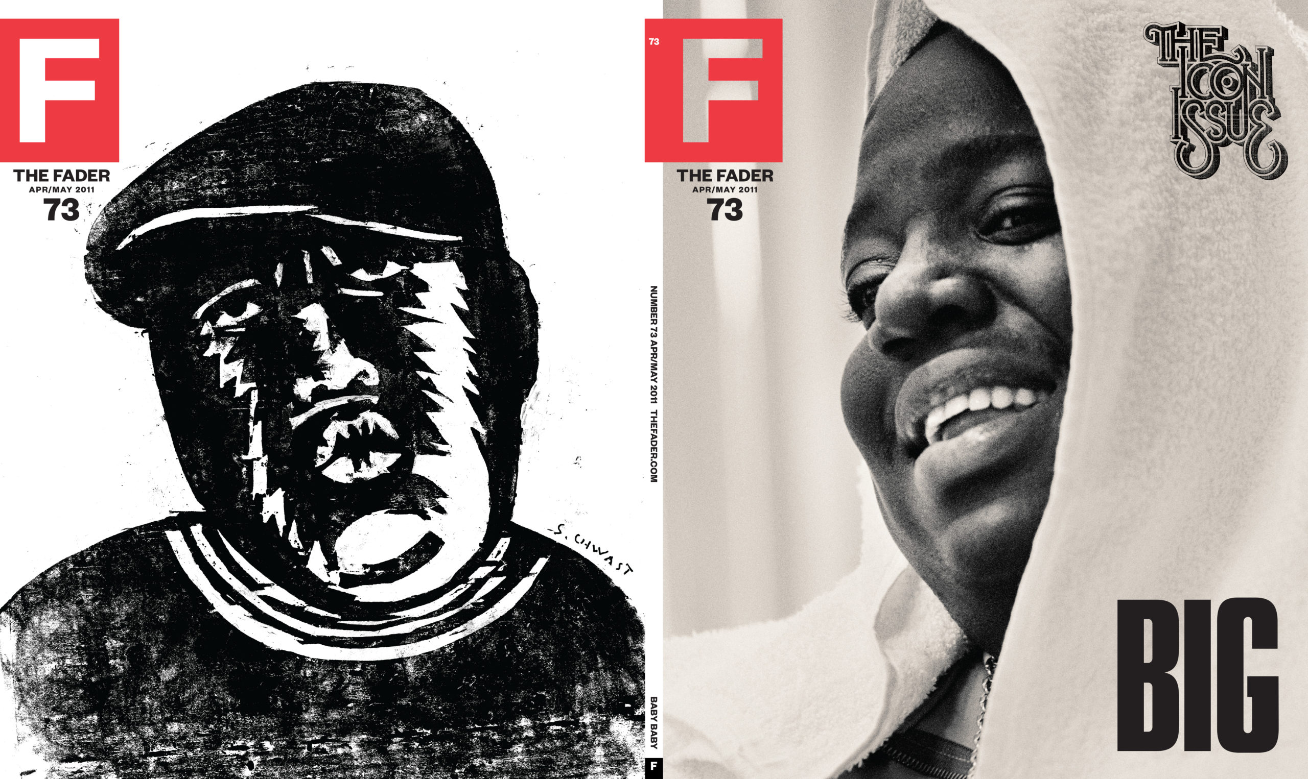
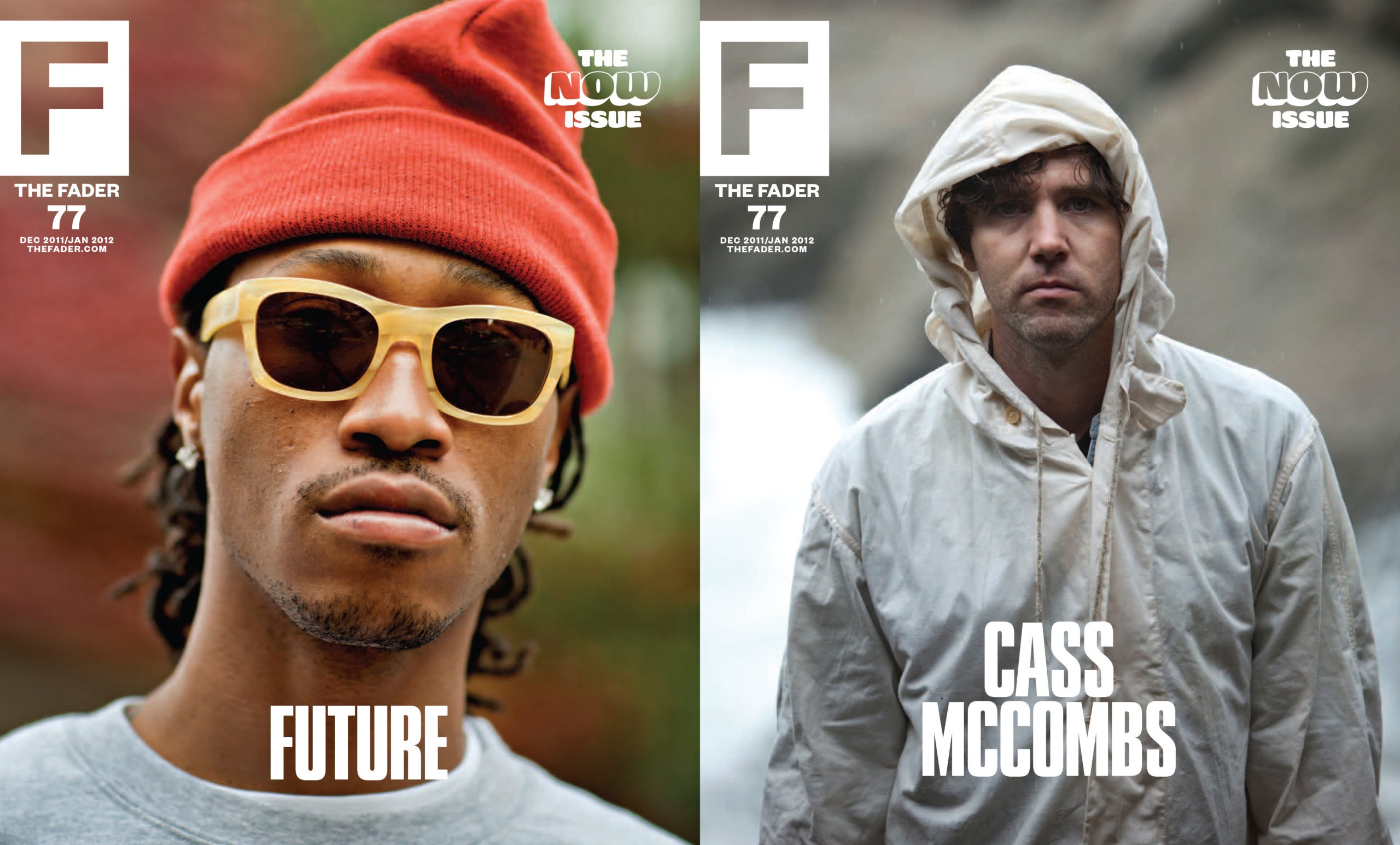
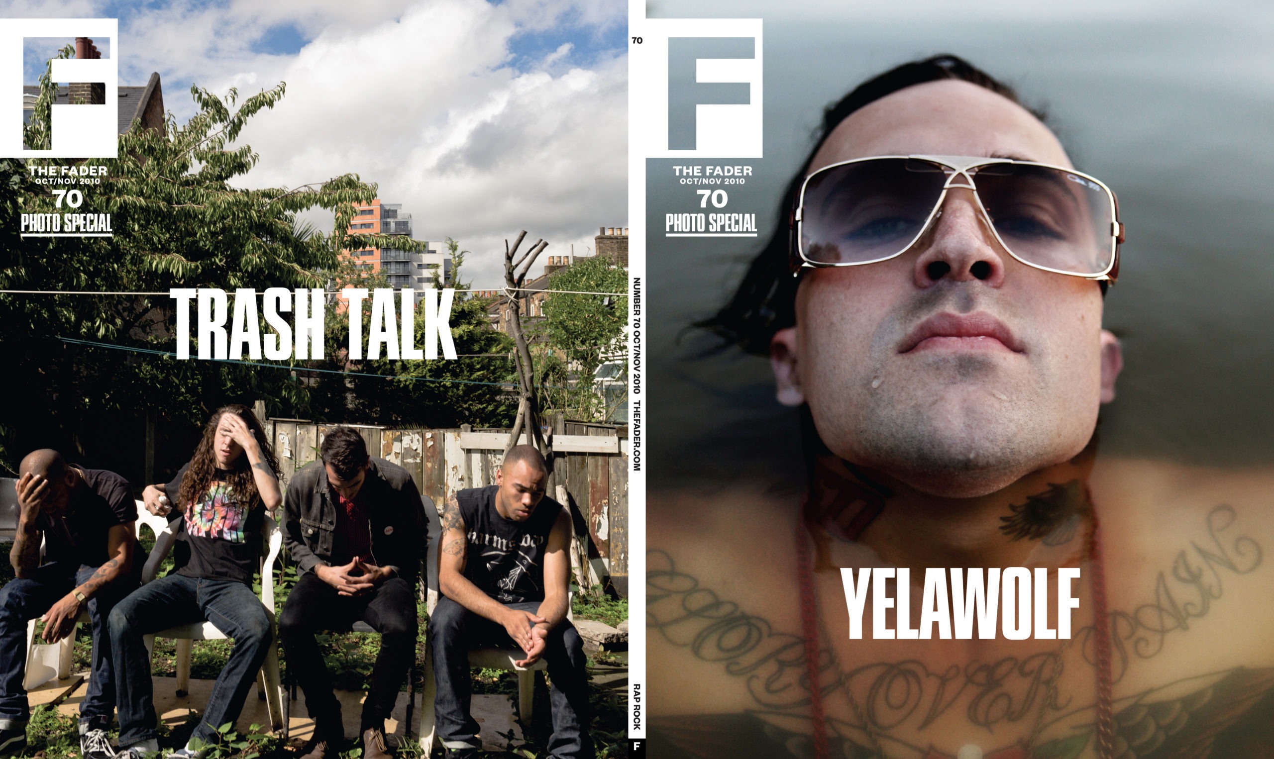
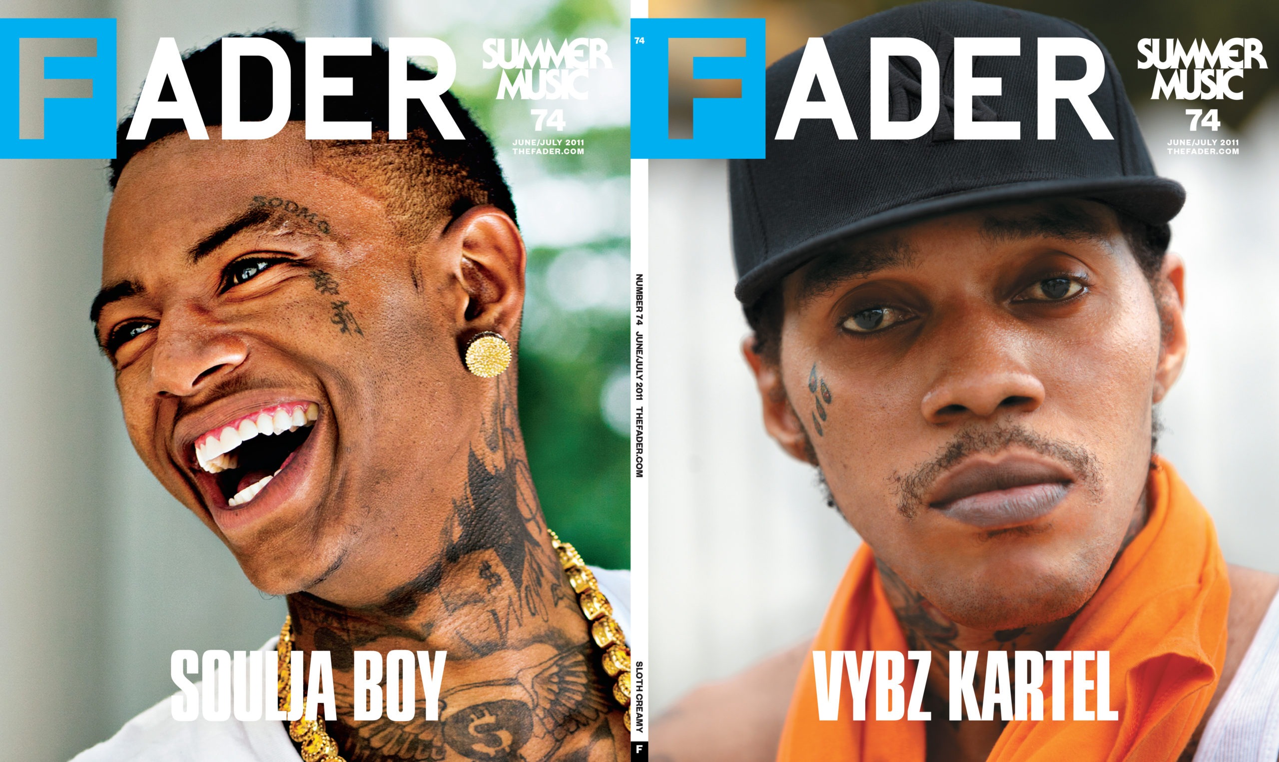
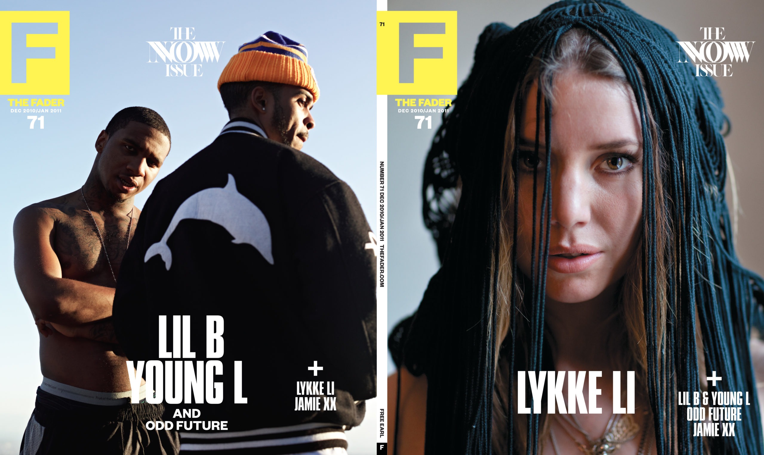
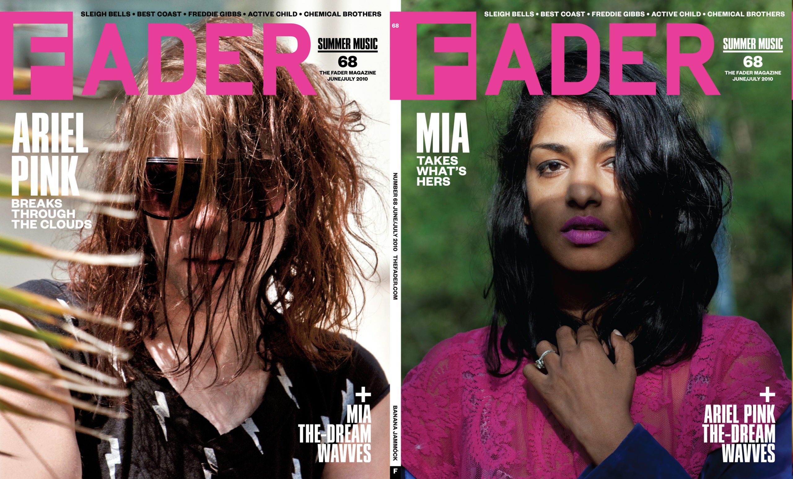
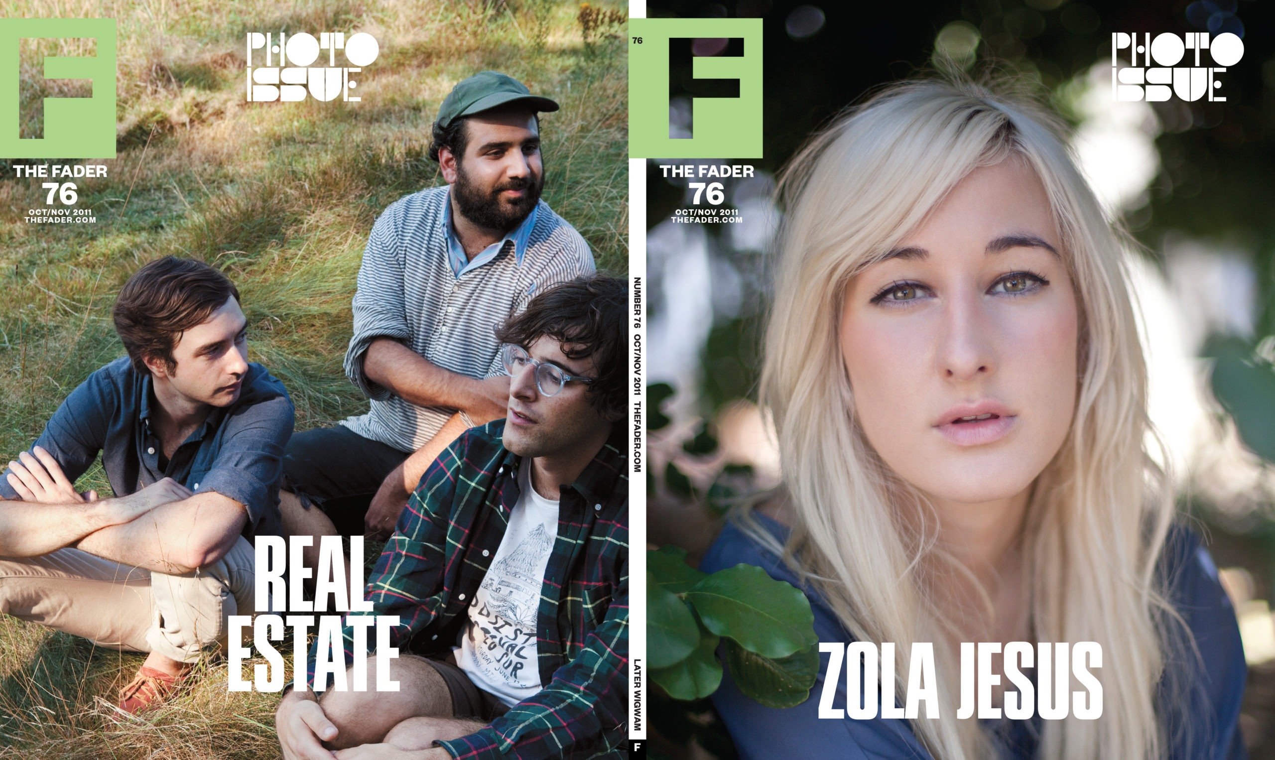
A strong feeling I had early on was to first minimize and then altogether drop the useless convention of coverlines. The FADER was known for its photography - why not leverage that almost exclusively and rely on the fandom of the artist and the excitement of what The FADER had to offer? Coverlines represented a old school way of thinking about what a magazine should do for its readership.
For subscribers, we went one step further and stripped the logo down to just the "F".
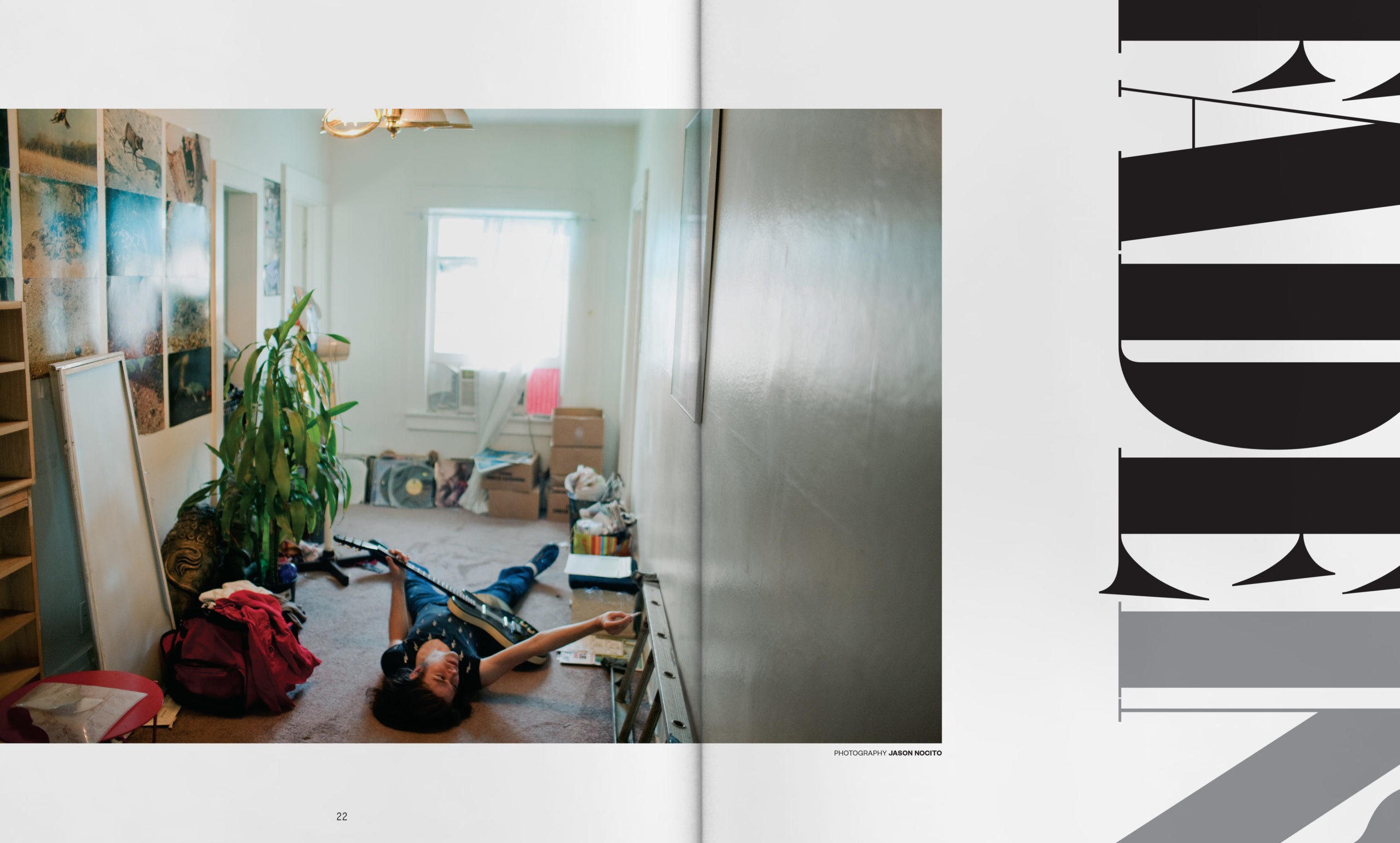
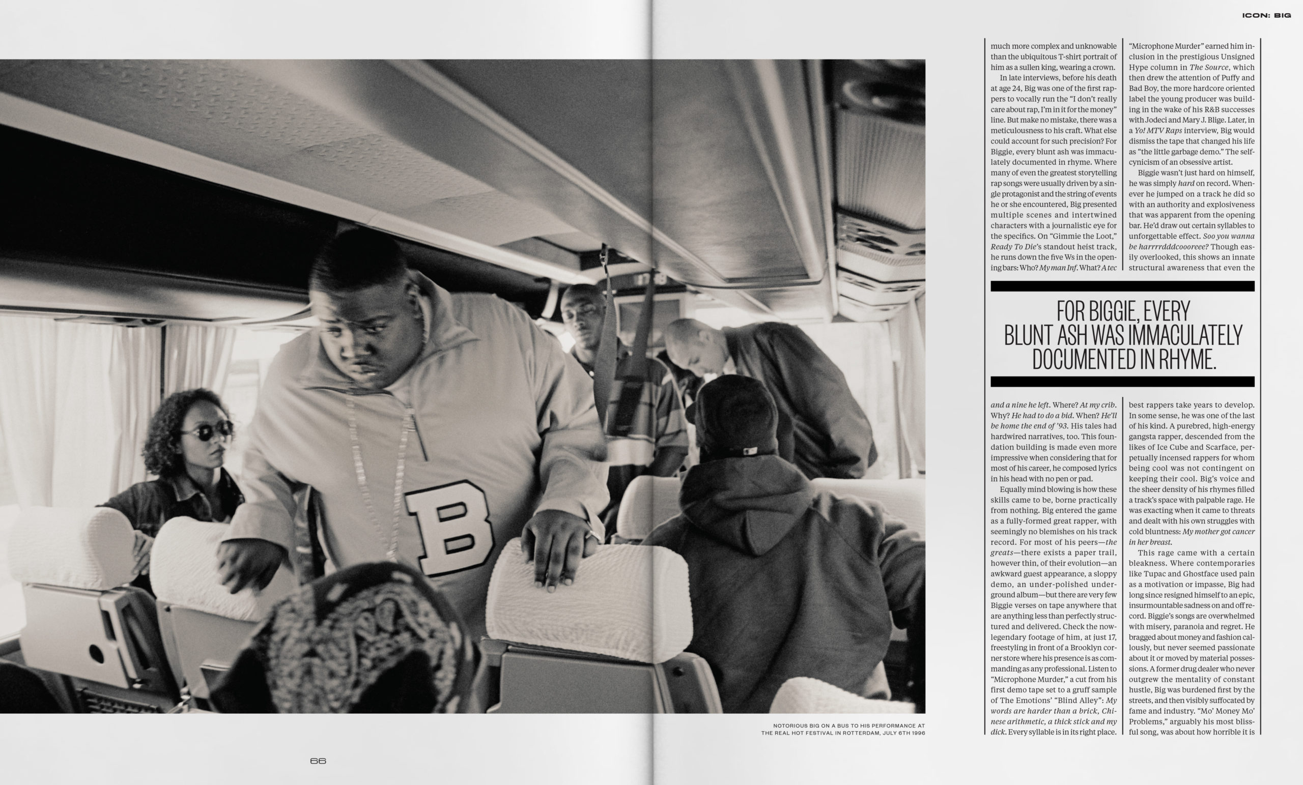
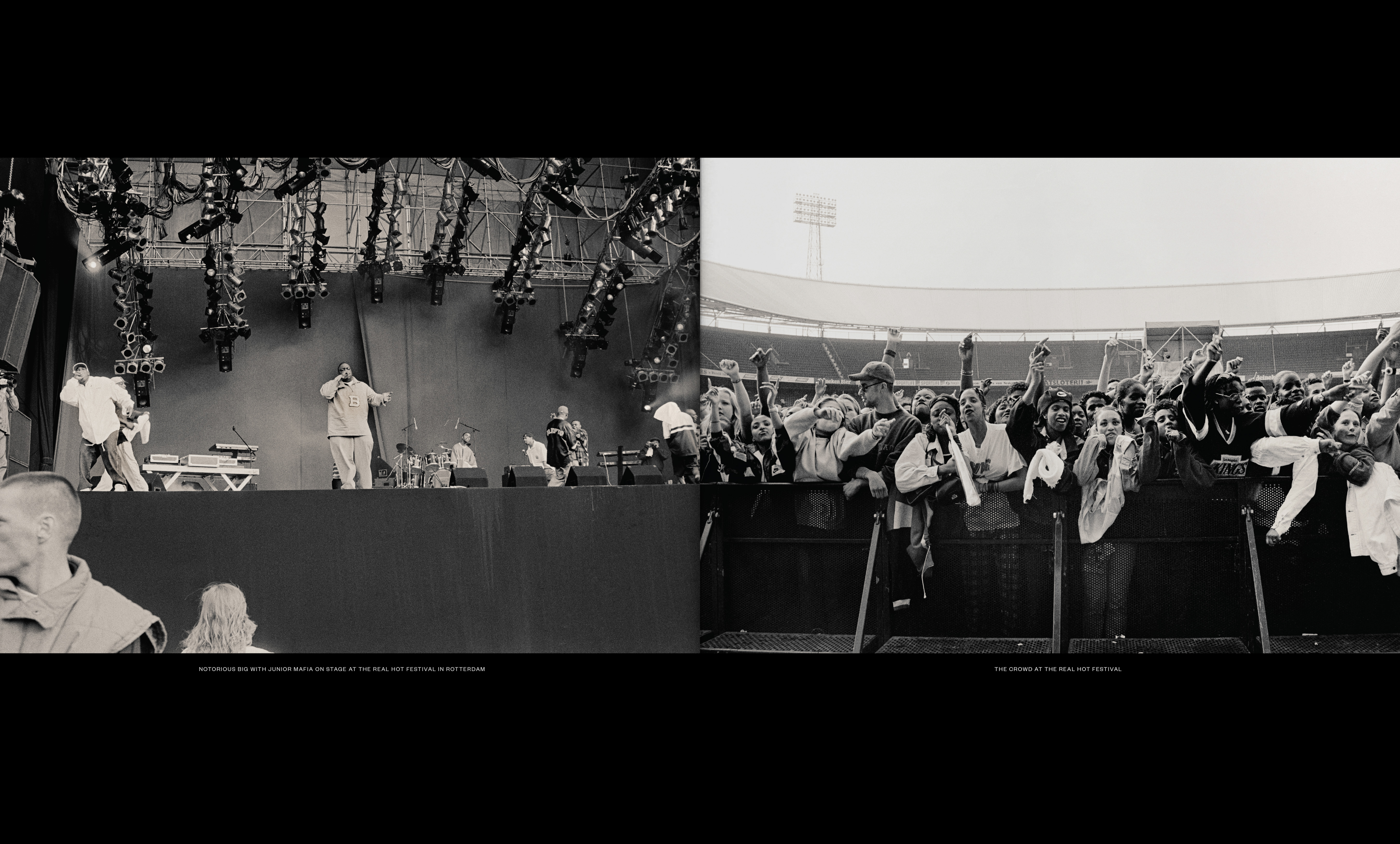
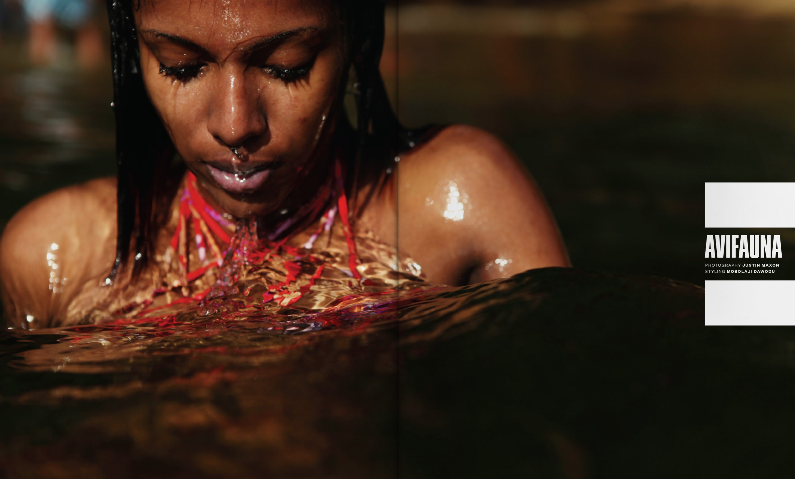
Within the magazine itself, everything was structured, as was before, around the incredible photography that was contributed to the magazine. In reimaging the way the magazine worked, this was generally the only area that did not need to be touched.
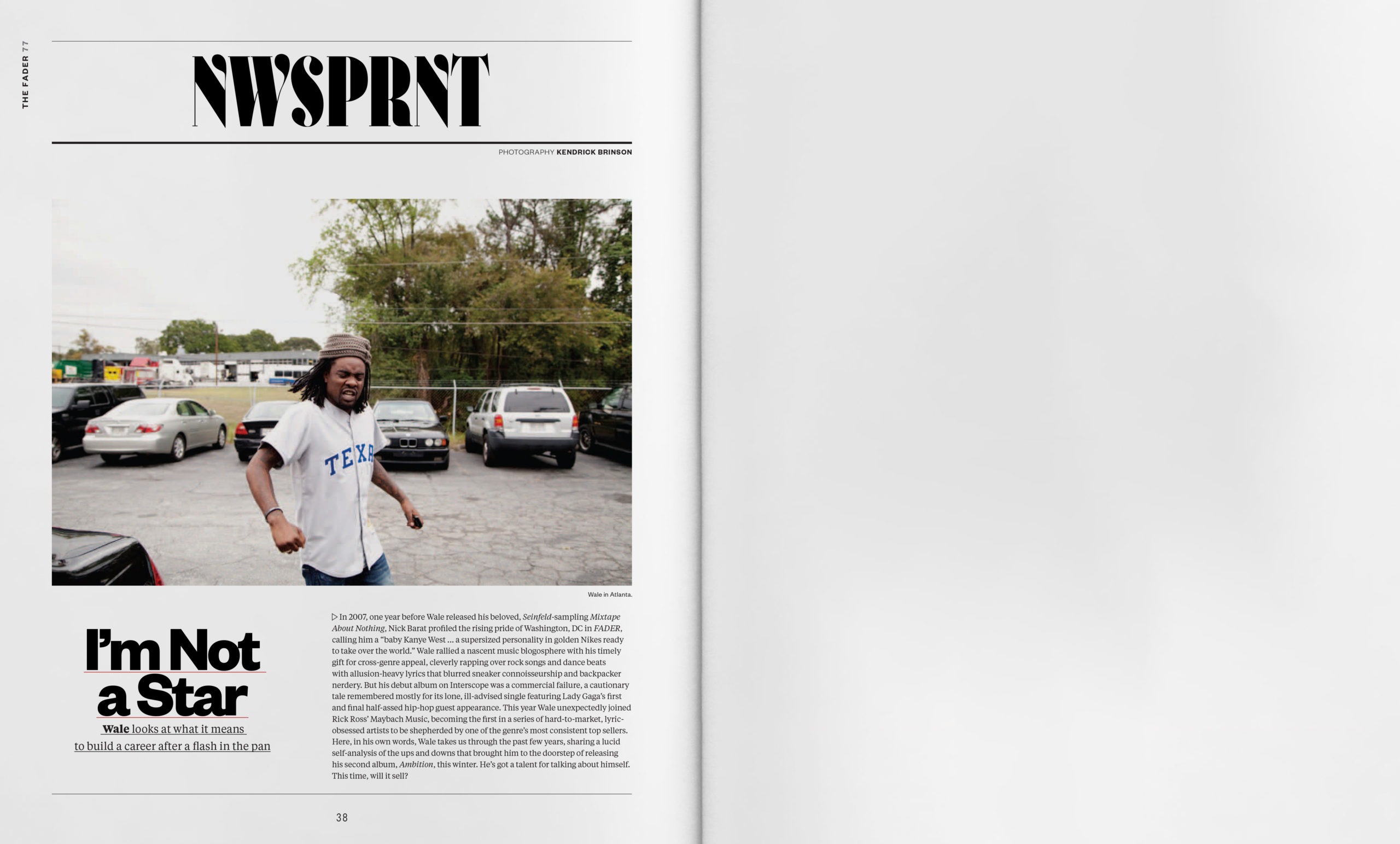
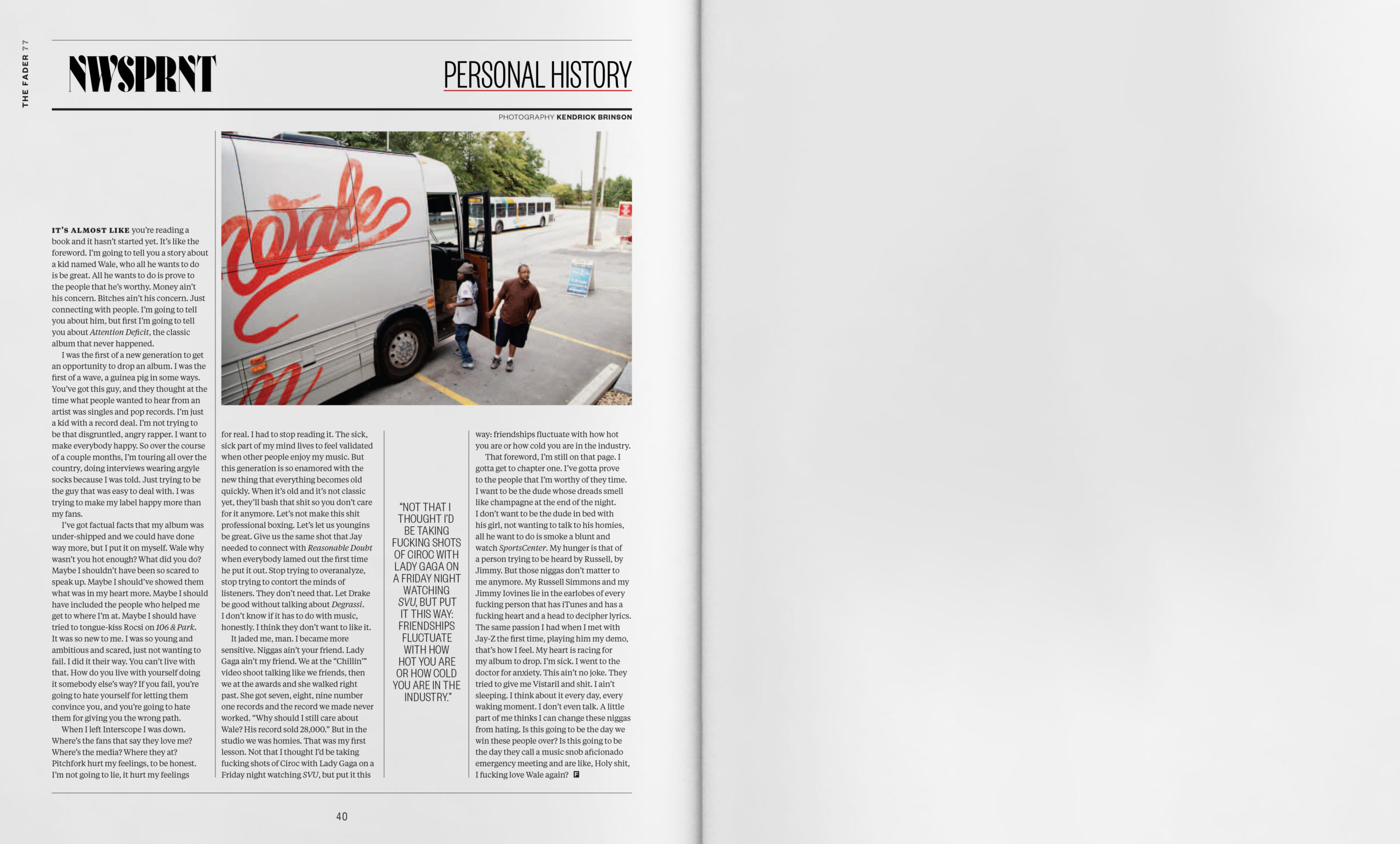
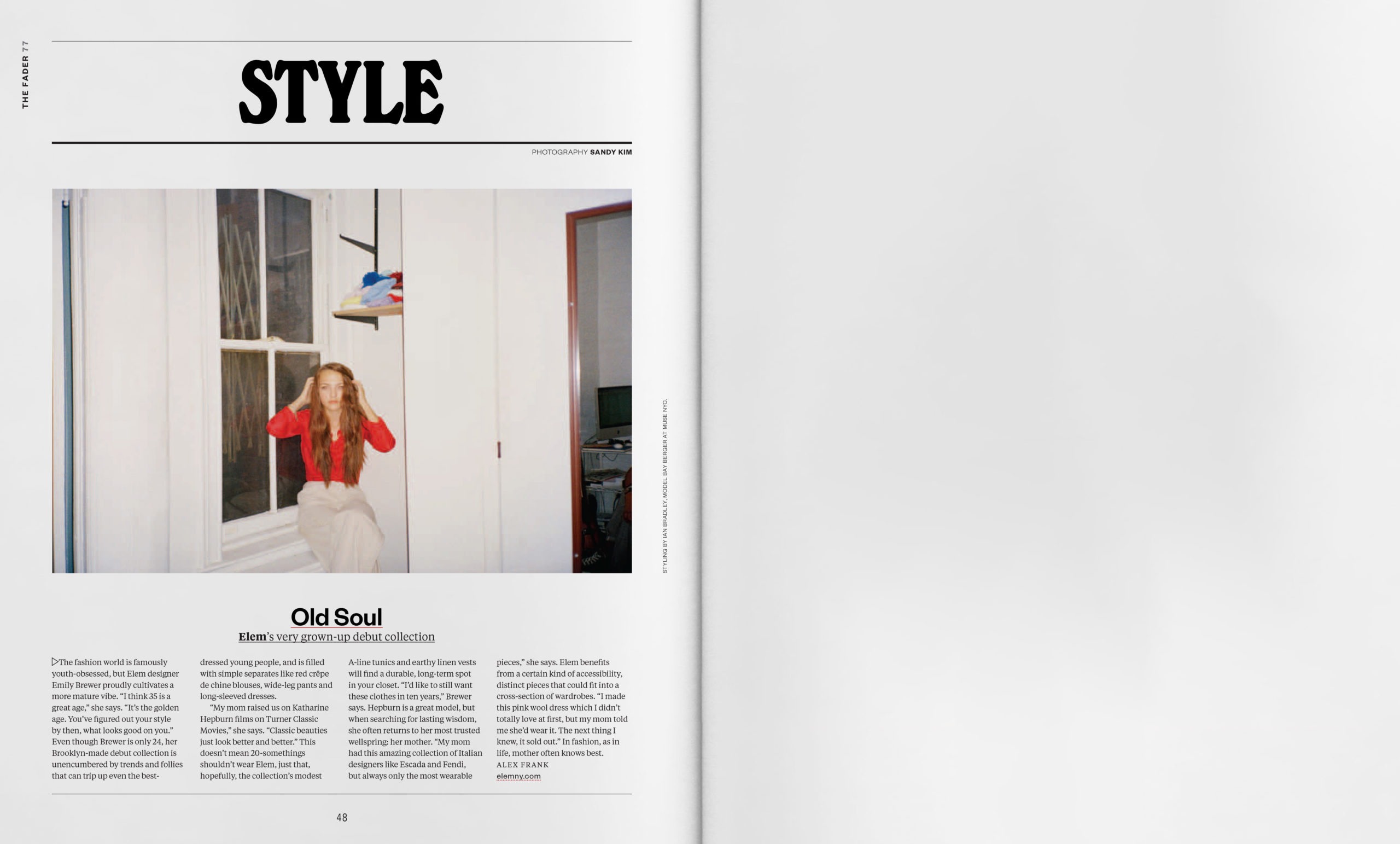
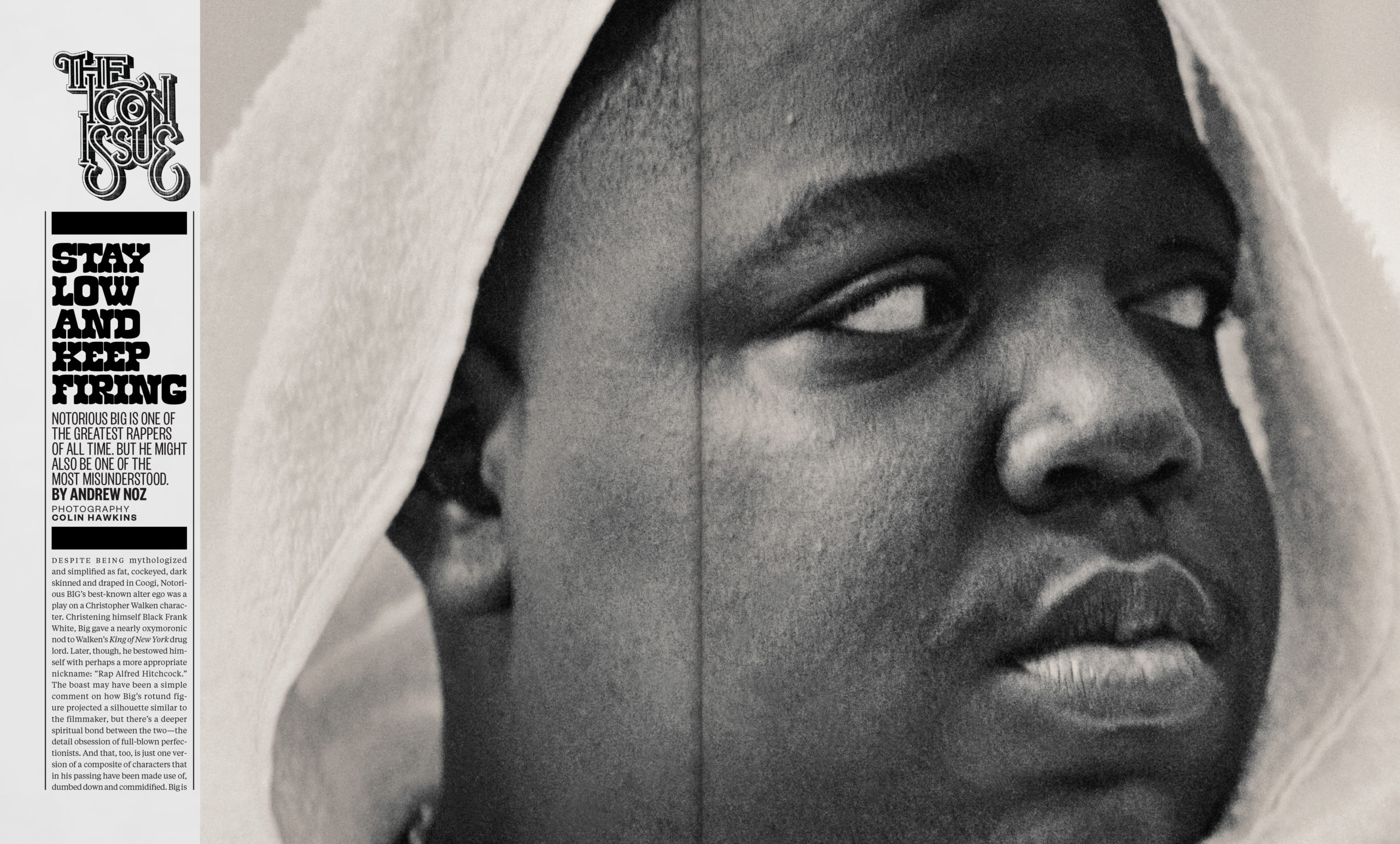
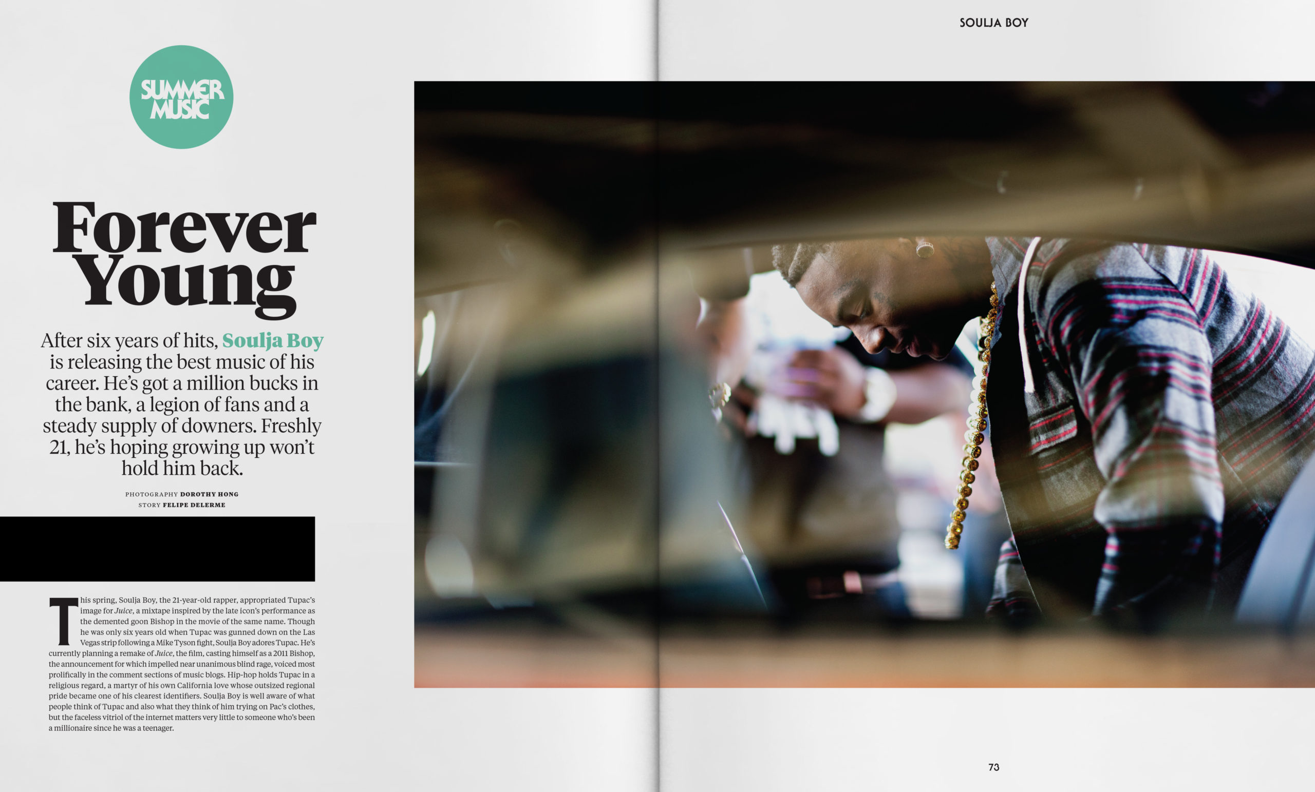
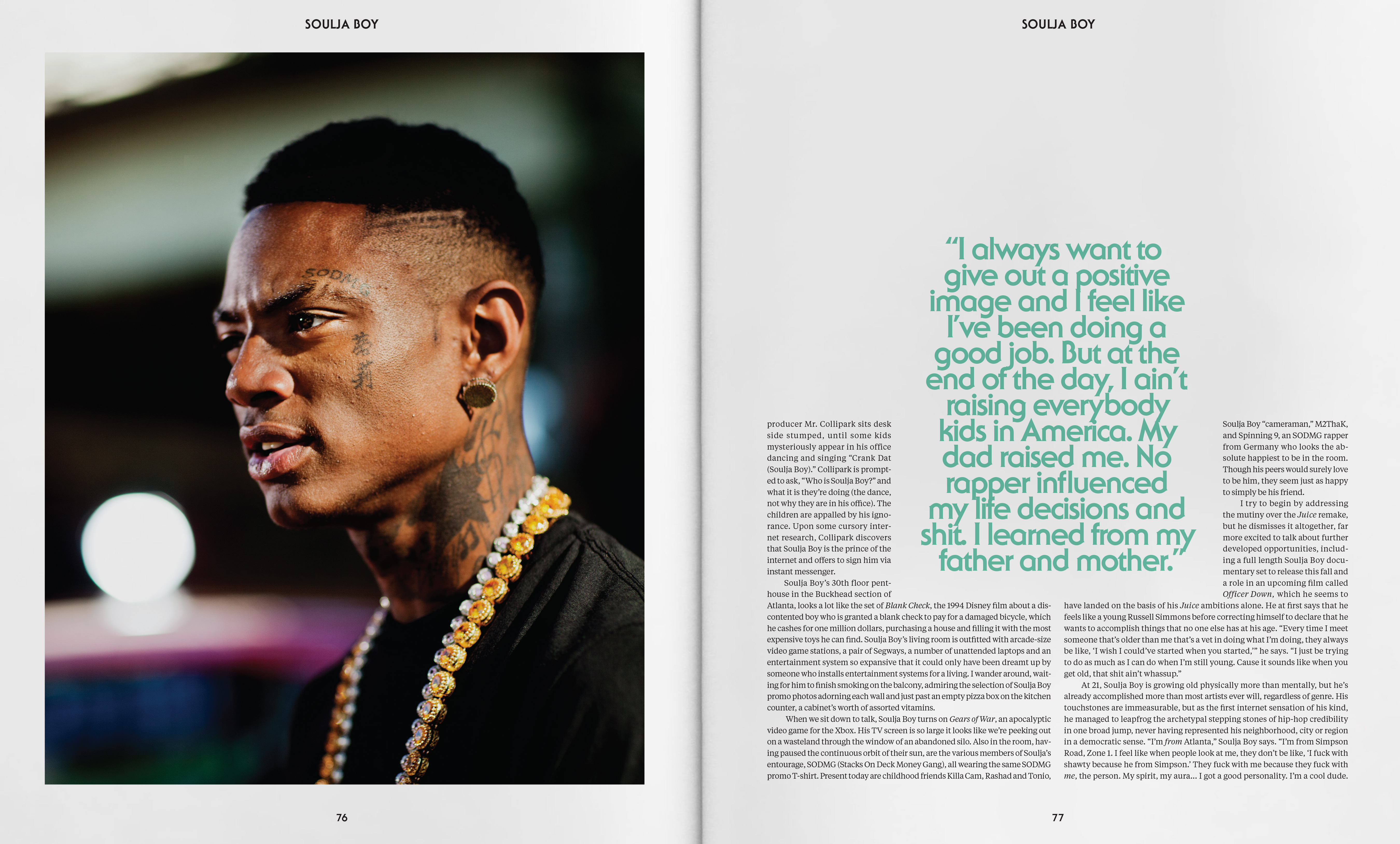
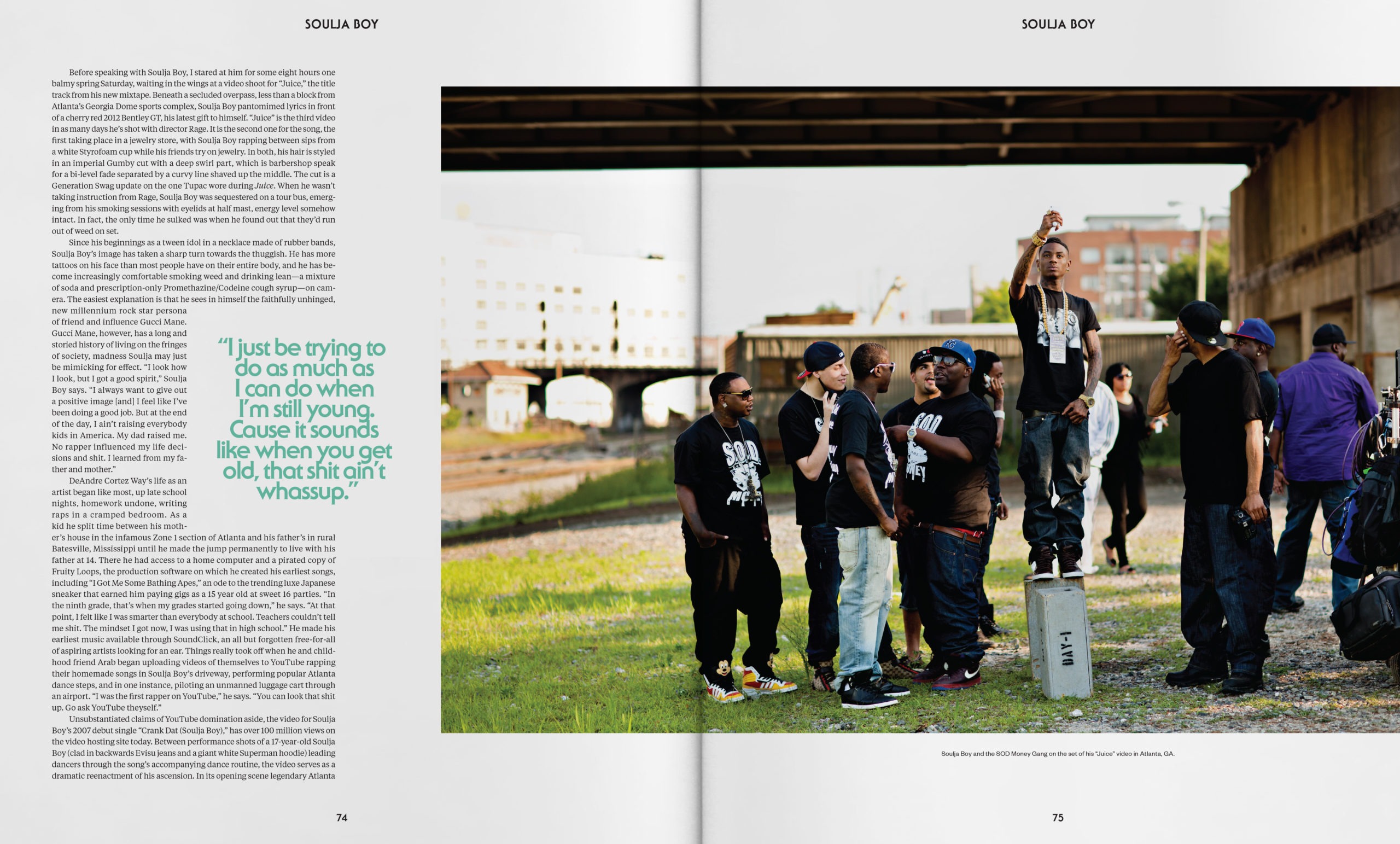
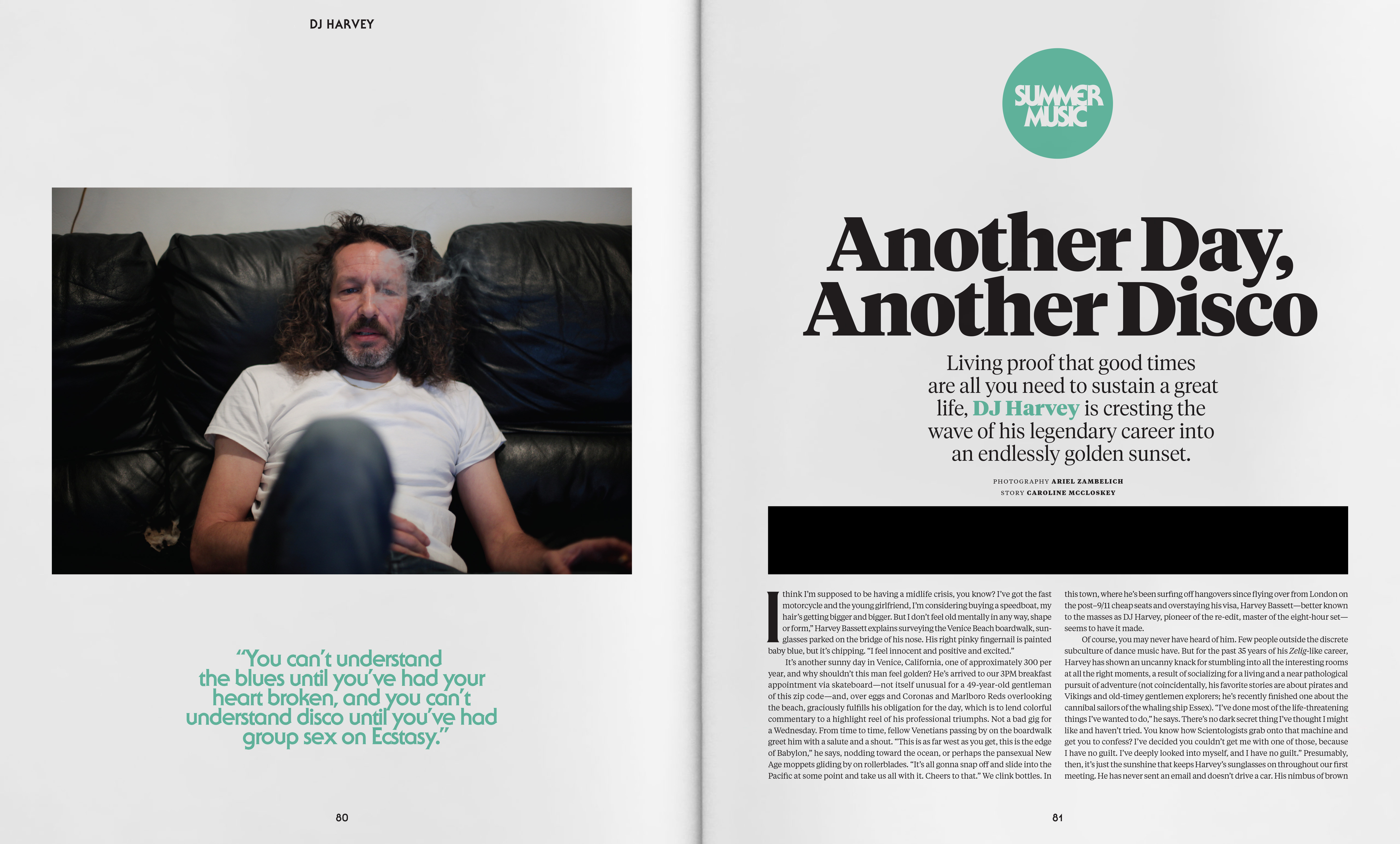
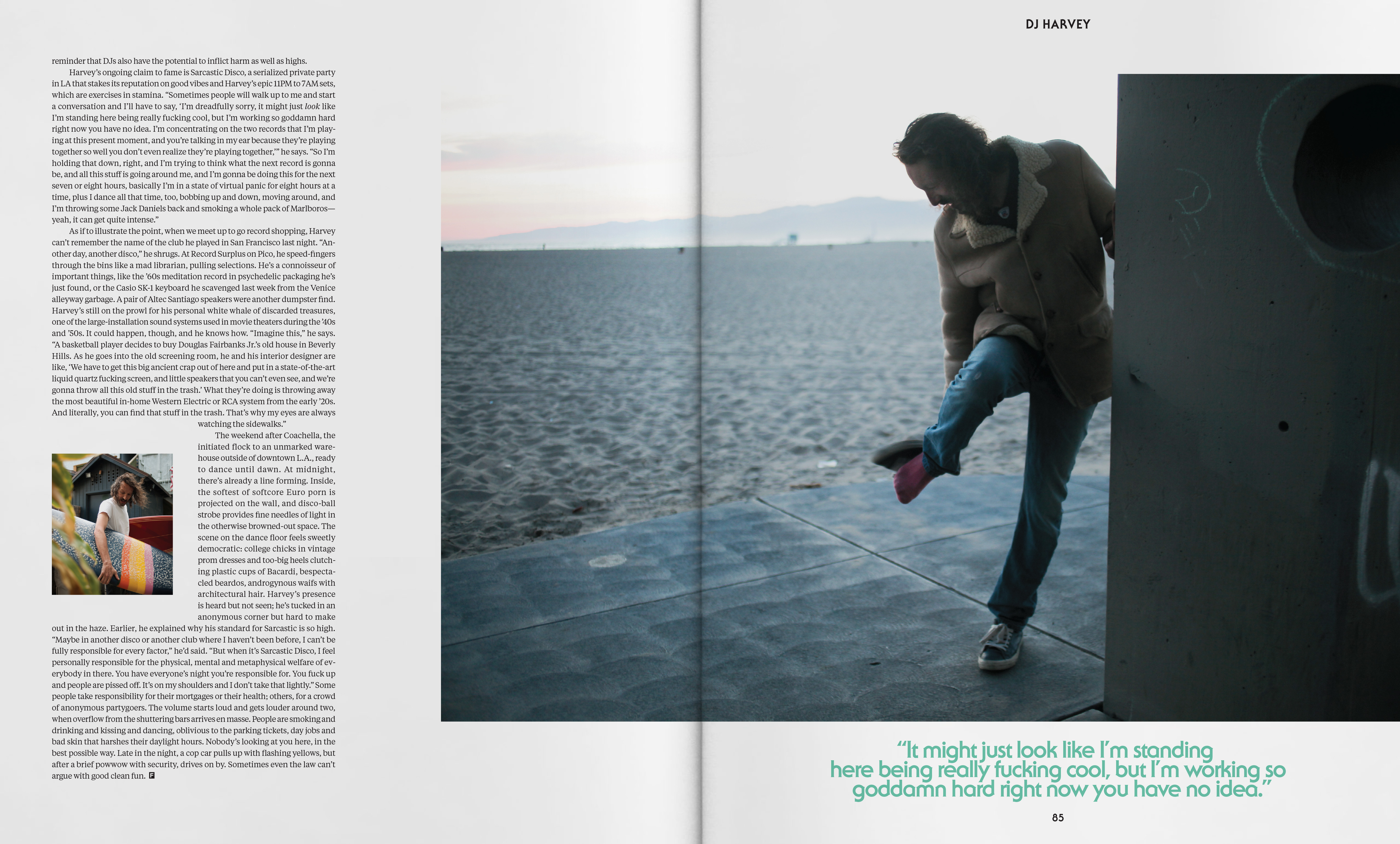
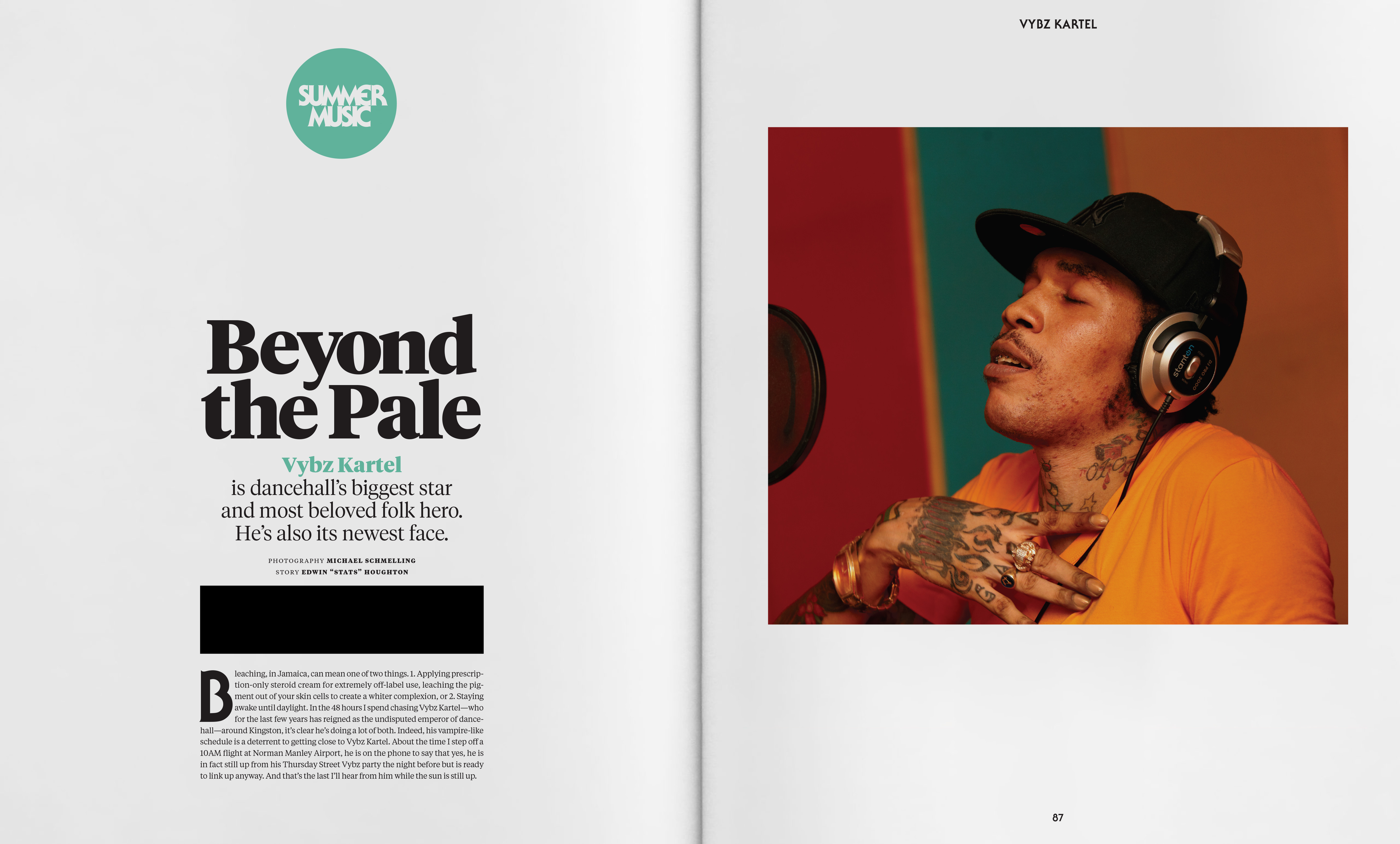
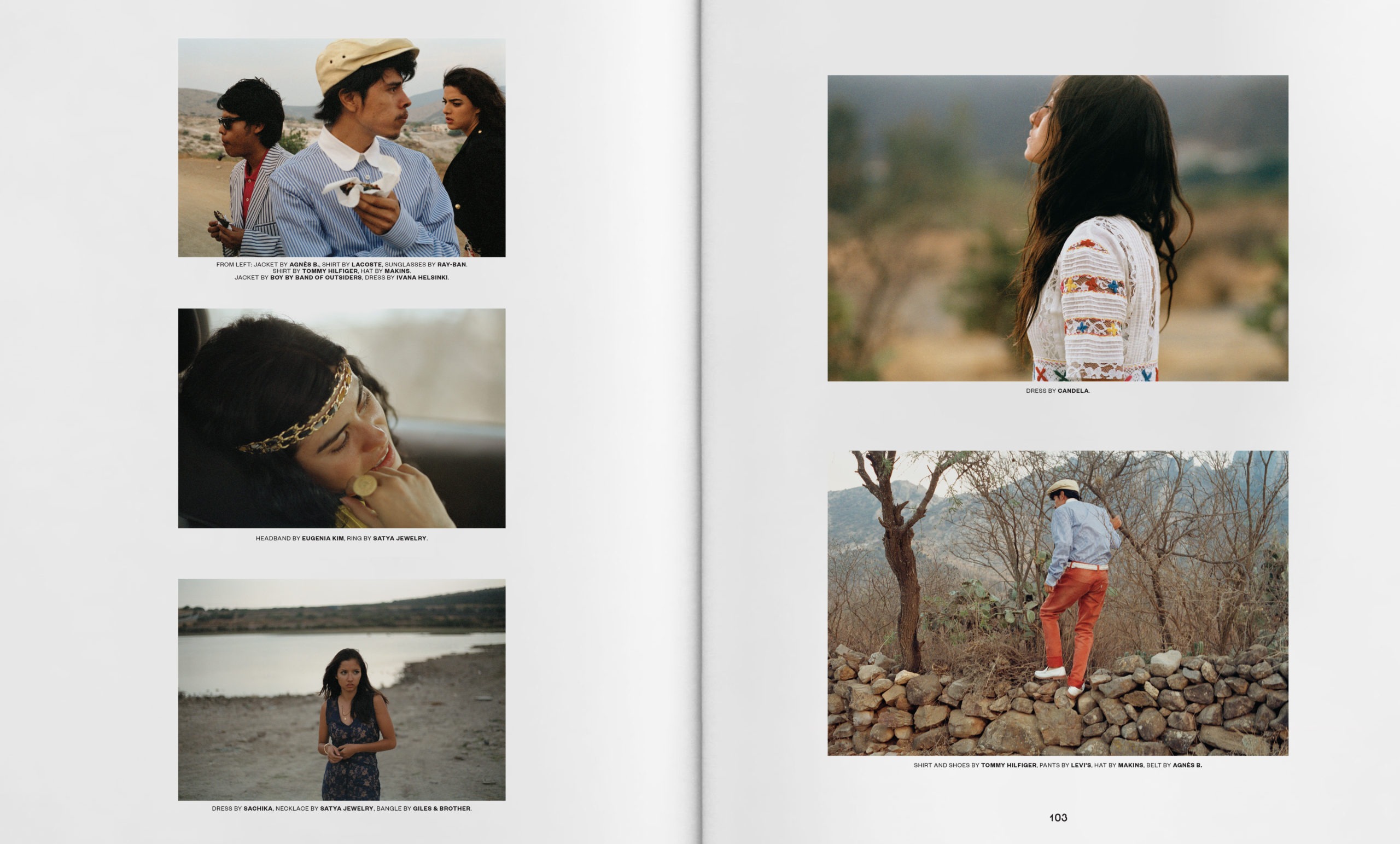
My main art direction change i wanted to make within the photography was to be able to bring out more youth and lightness - the documentary style the magazine was known for was incredibly composed and cared for, but occasionally suffered from feeling too somber. We needed energy.
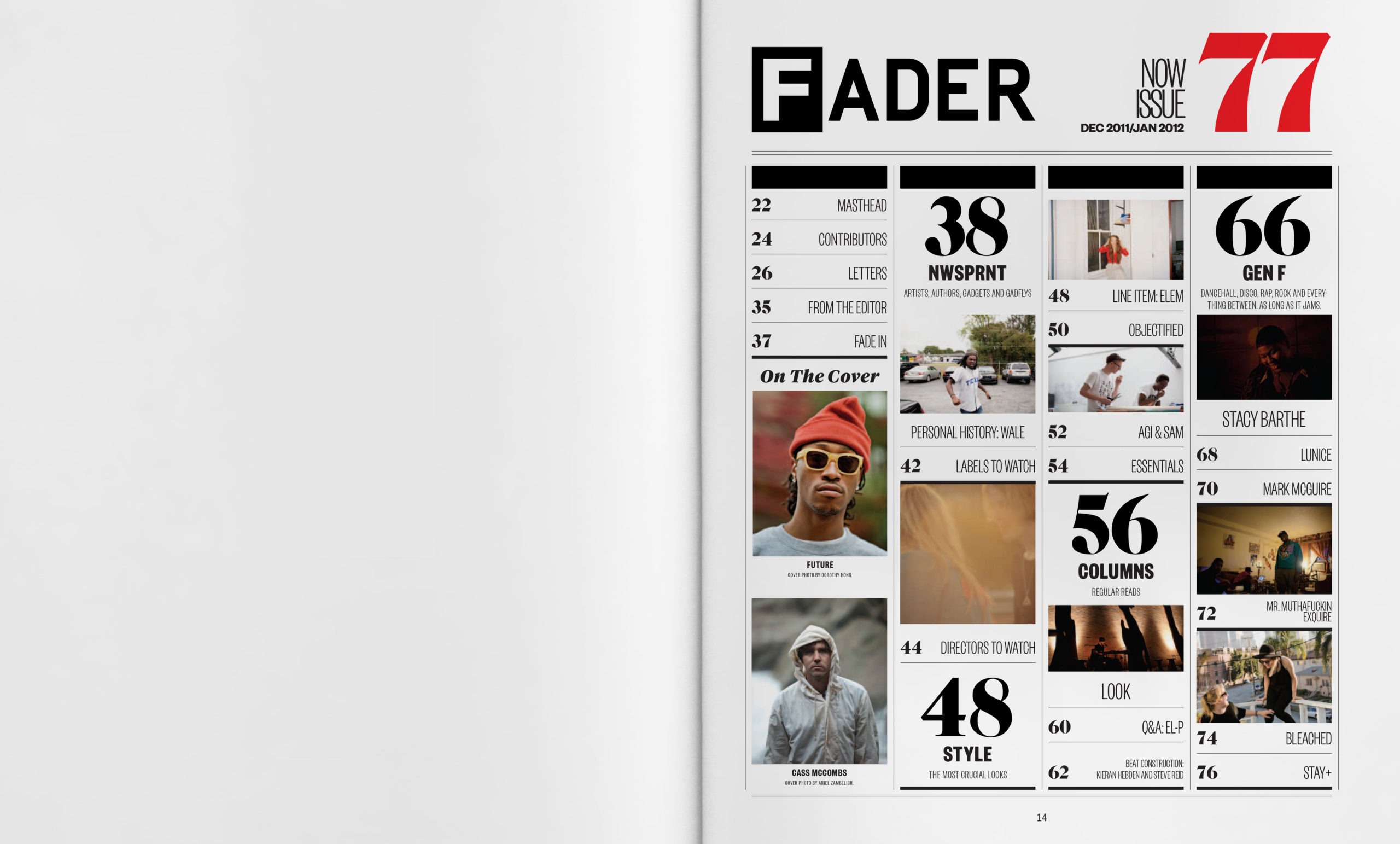
Elsewhere, a more usable structure was defined - a tighter 12 column grid that worked modularly to support everything from front of book throught he feature well was built. Pages were re-imagined to be more friendly to holding multiple stories up front, and features could hold more text than was previously possible.
Typography was based on pre-releases of Founders Grotesk and Tiempos from the ever talented Kris Sowersby whom i was lucky to be able to work with. This was supported by decorative headline faces from various sources and some of my own headline type.
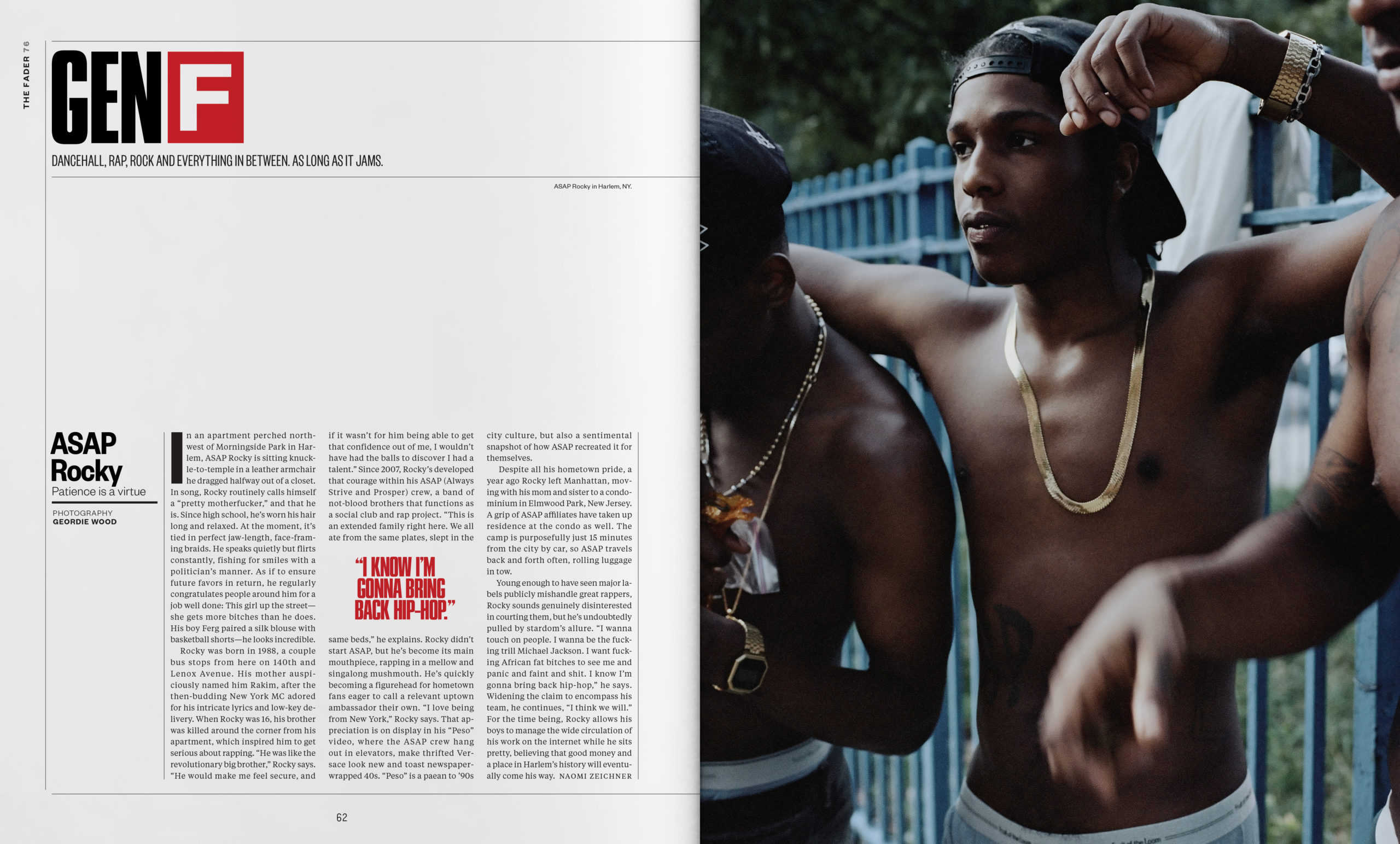
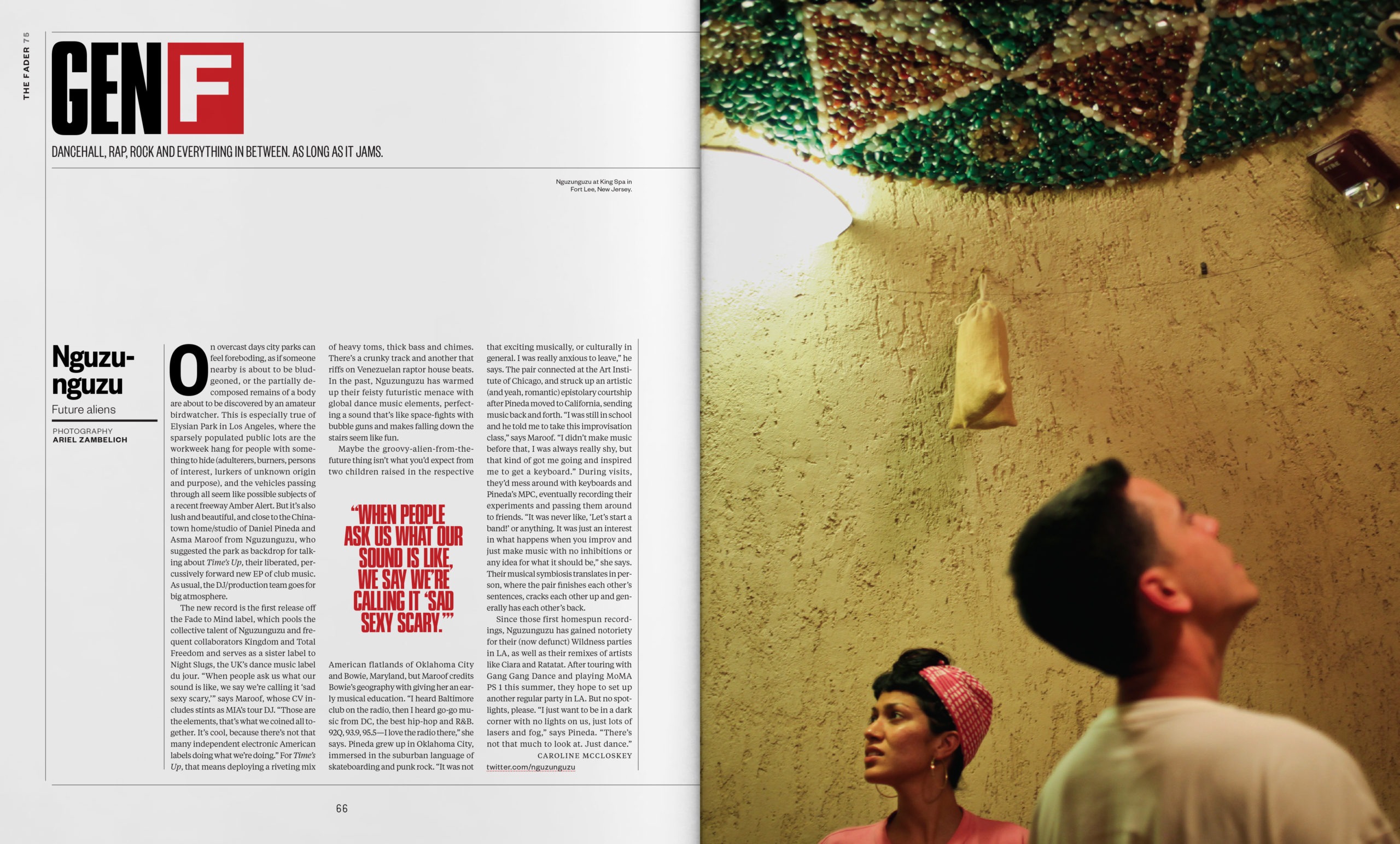
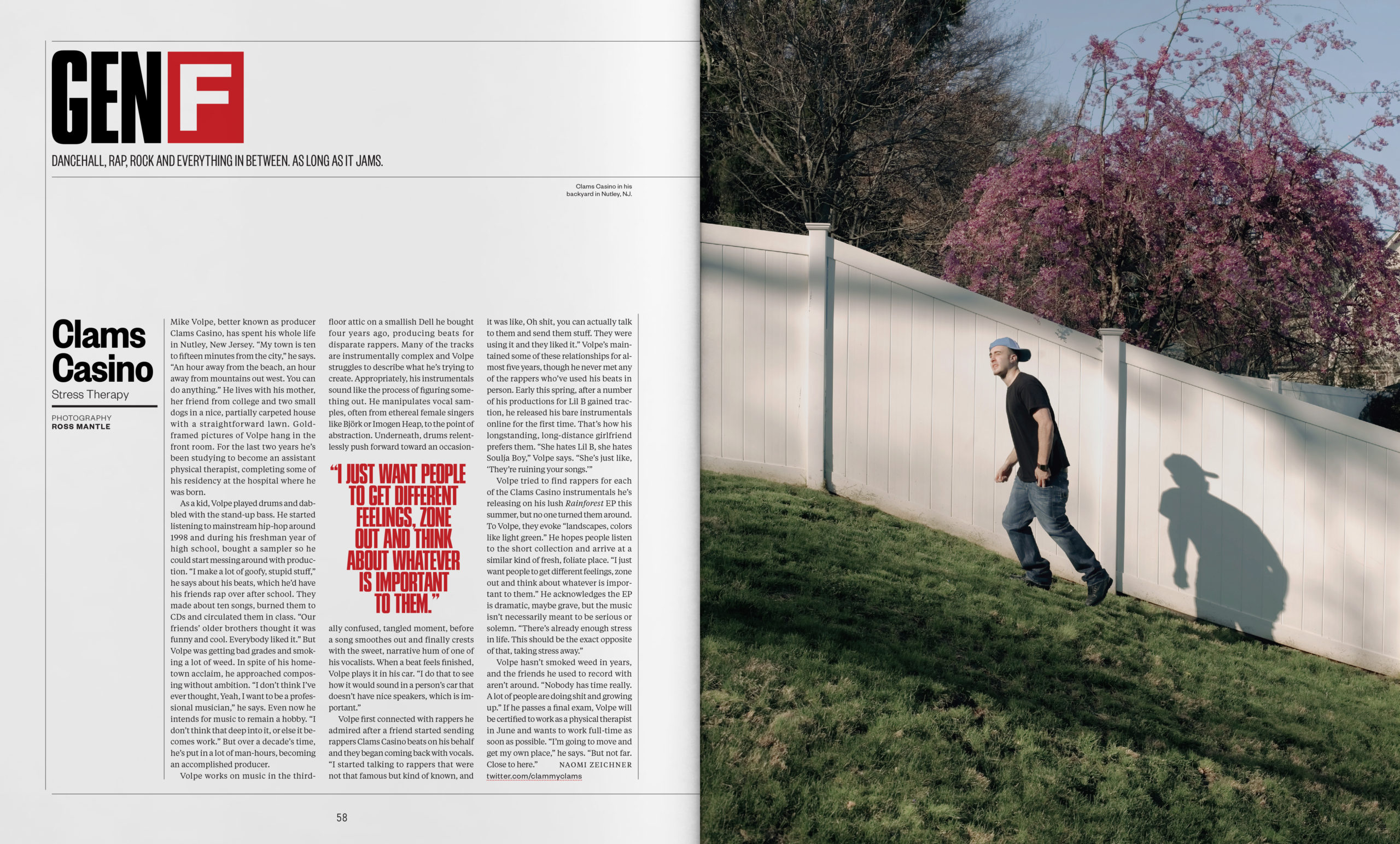
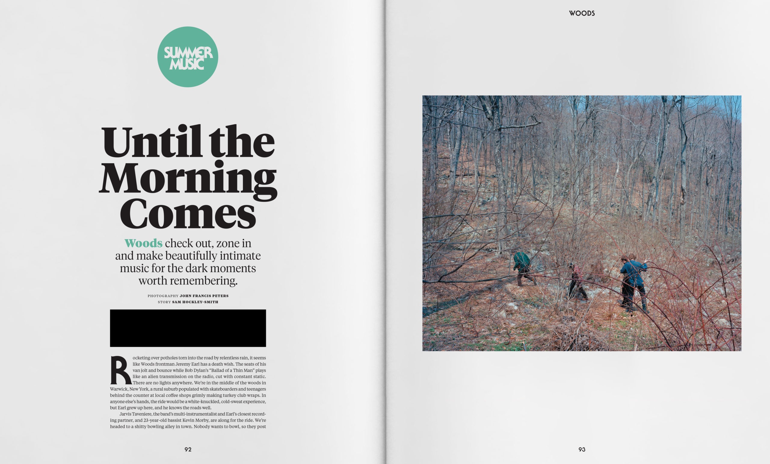
The Gen F section was rebuilt to be a more substantial "featurette" segueway to the main features. Vertical photography was introduced alongside more graphic compositions in the imagery to make a clearer break between the front-of-book and features.
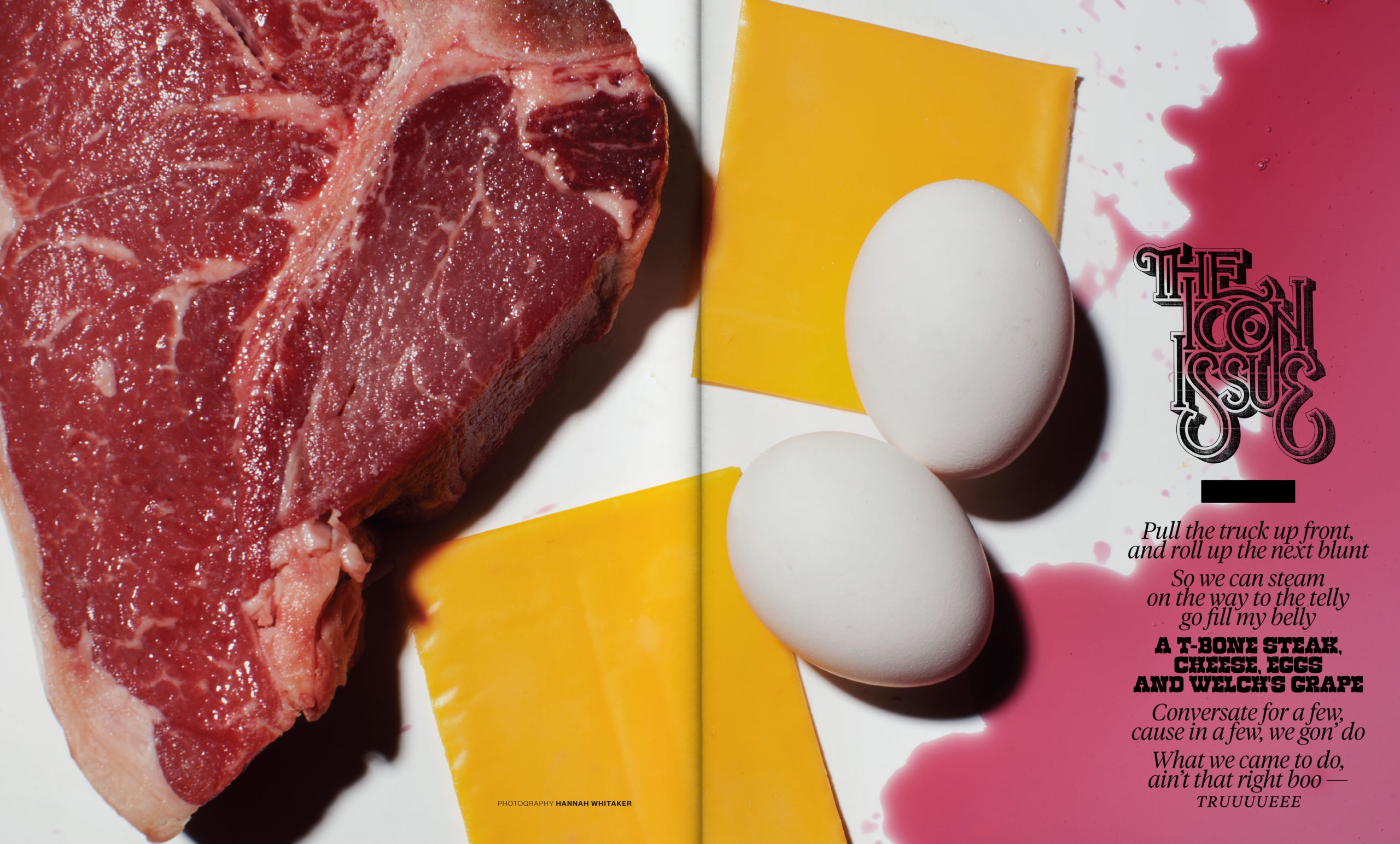
The features themselves retained some of the structure of the front of book, but had flexibility to express the specific issue concepts as needed. This helped create a diversity in aesthetic from issue to issue which I felt was important to properly connect with the different communities that The FADER spoke to.
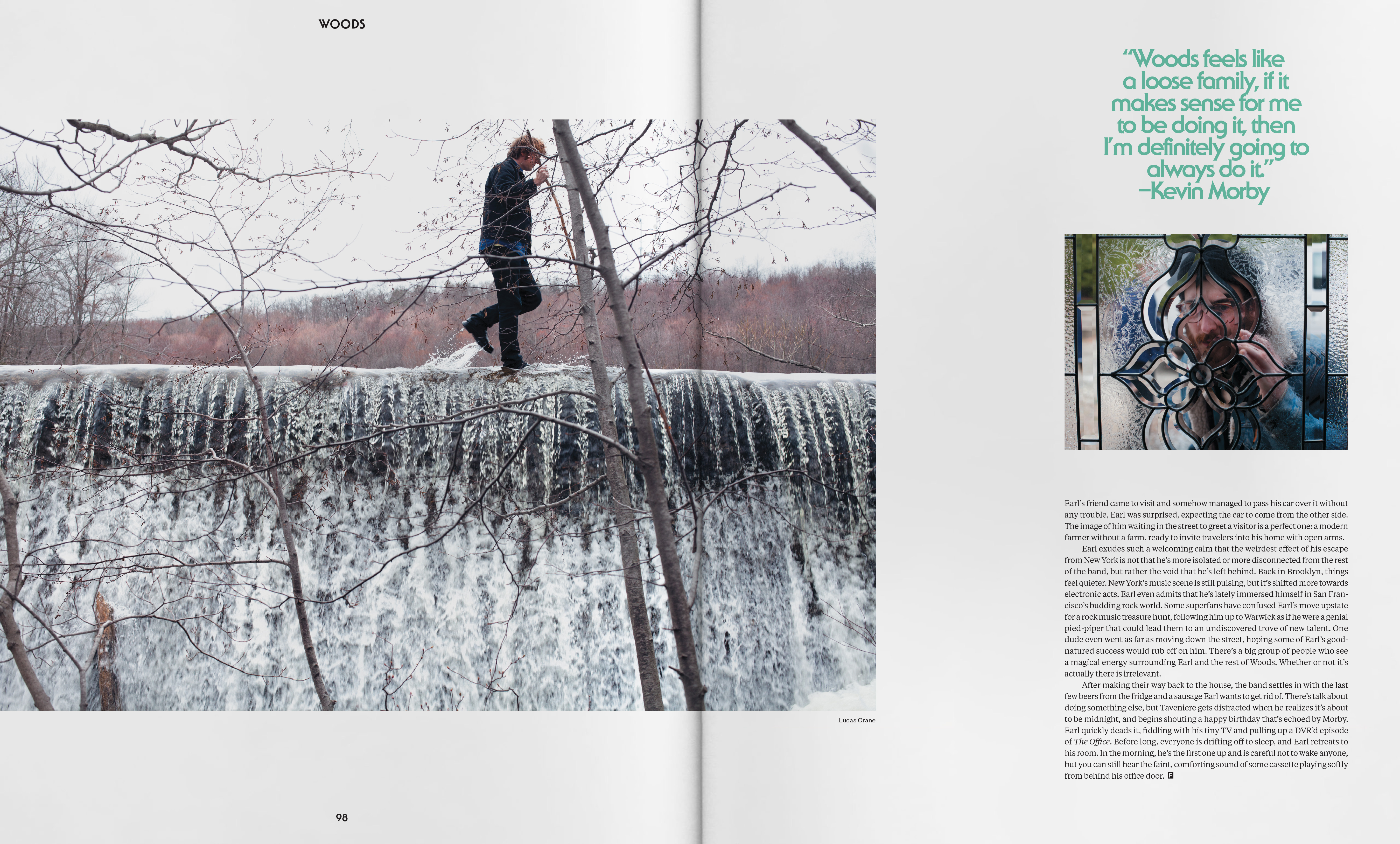
The flexibility in design was assessed for each issue, but then all feastures - regardless of genre of music or style of feature - were all applied with that one look. It created a expressive but organized feel that helped to establish a "FADER voice" that can talk about anything and everything within our editorial purview.
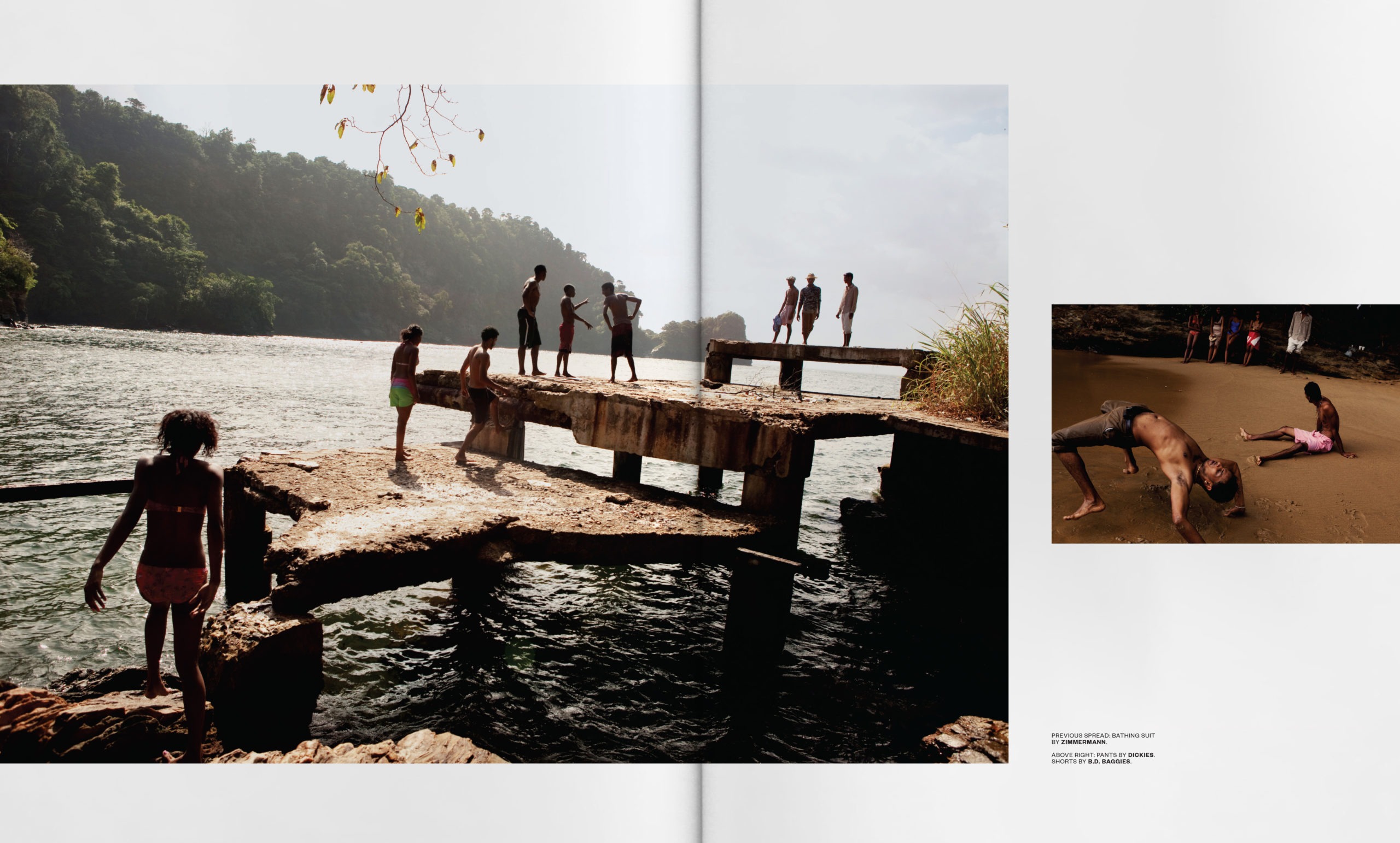
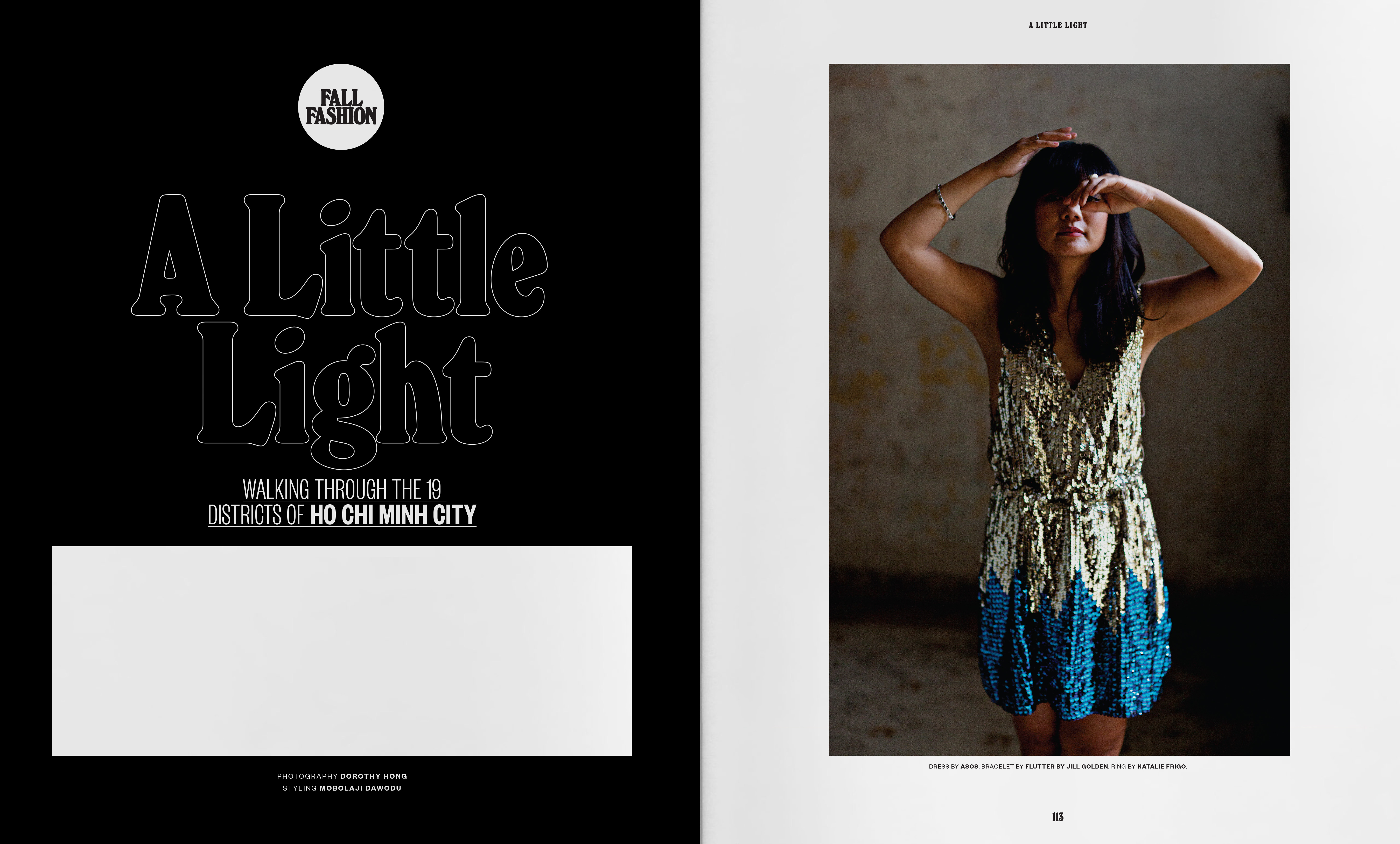
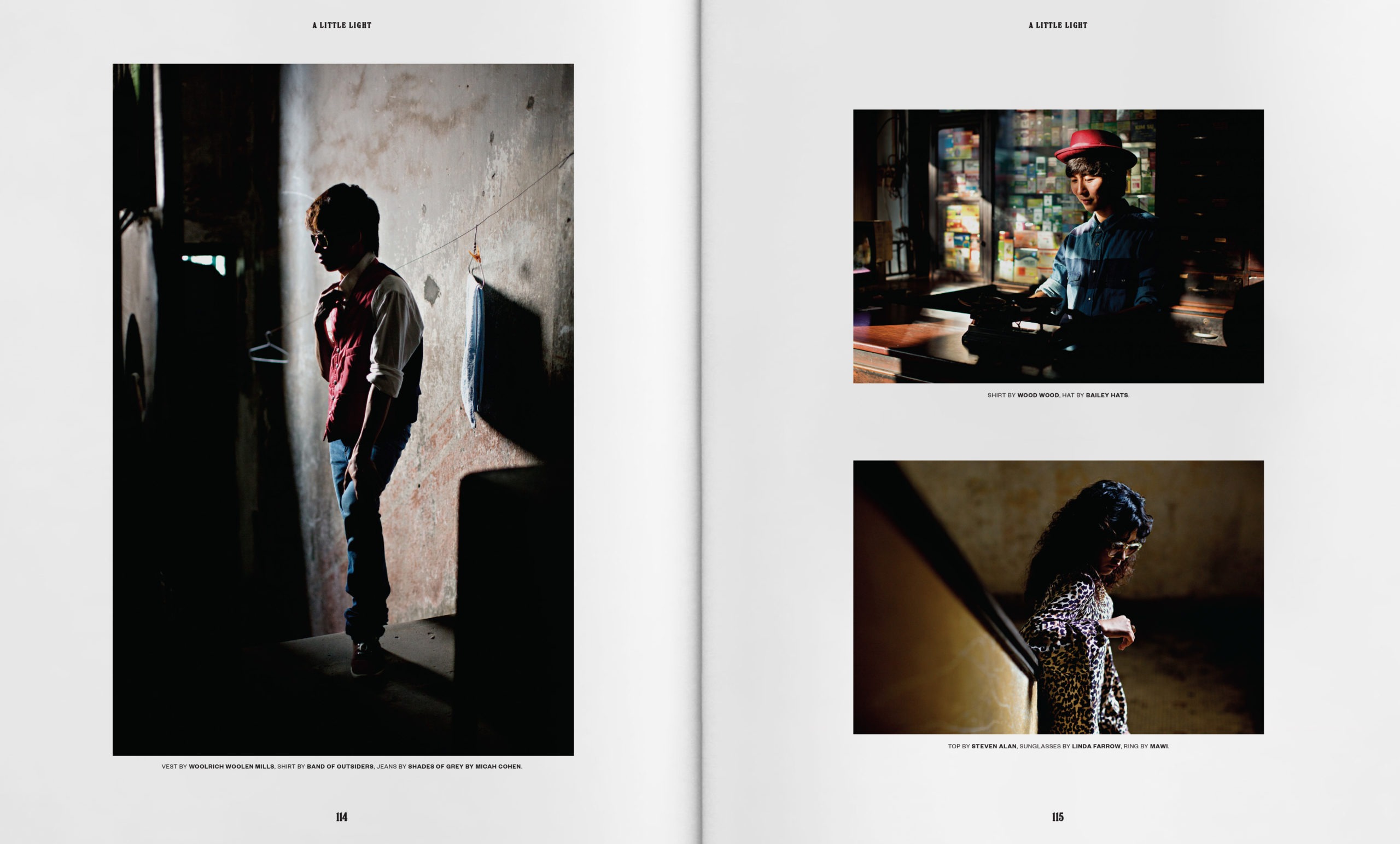
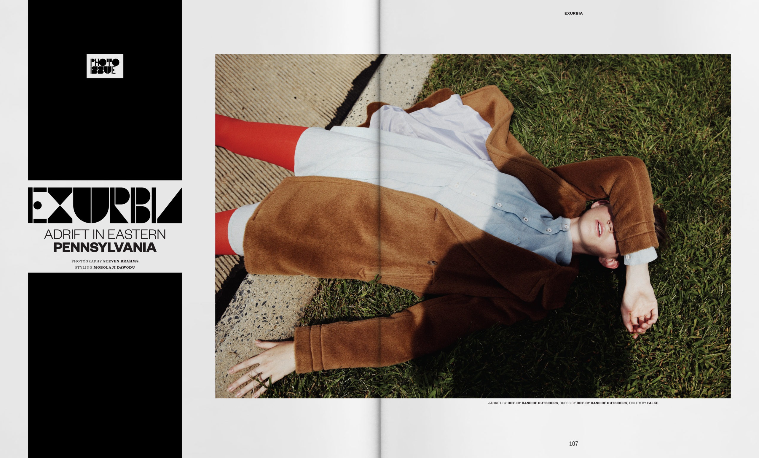
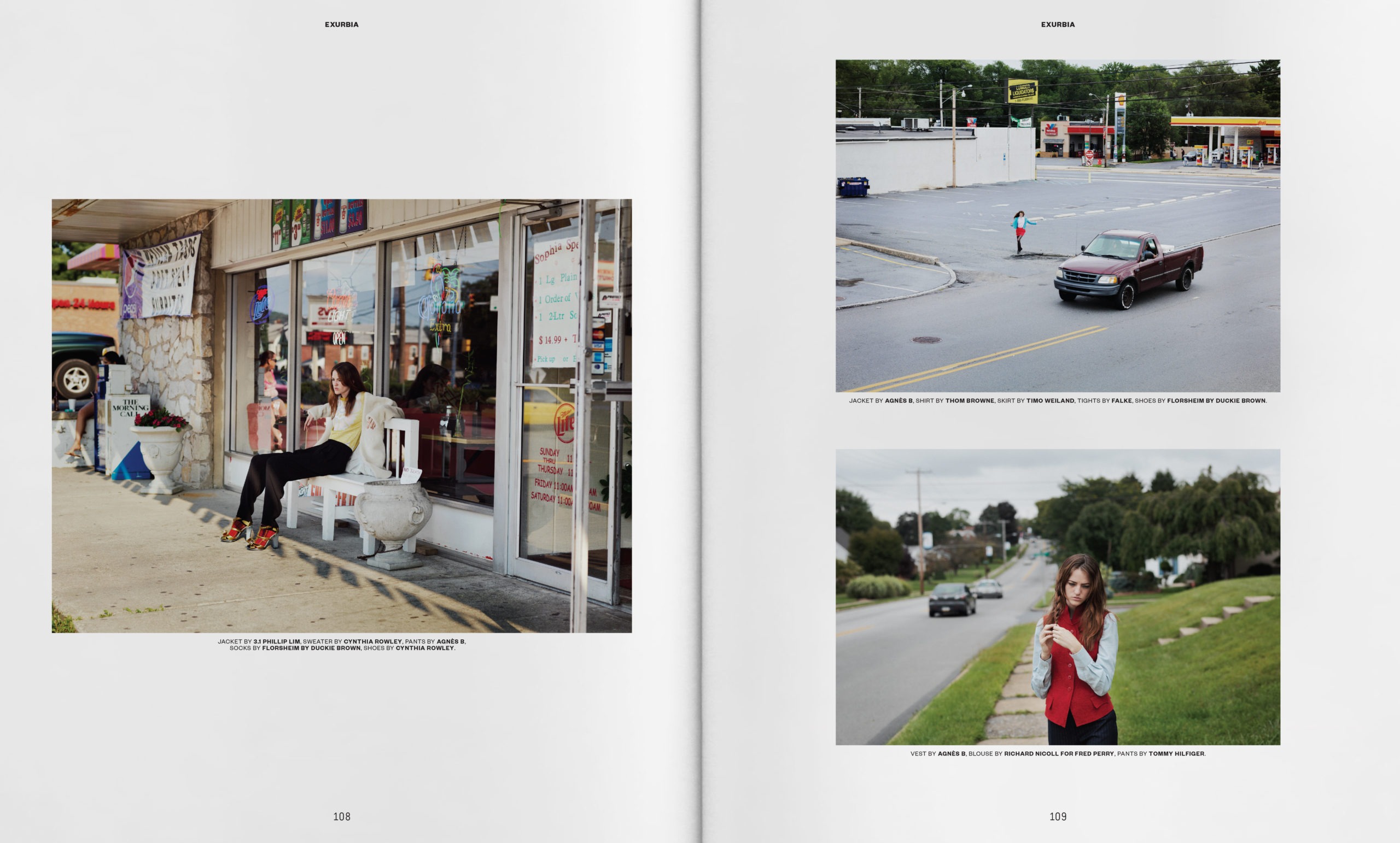
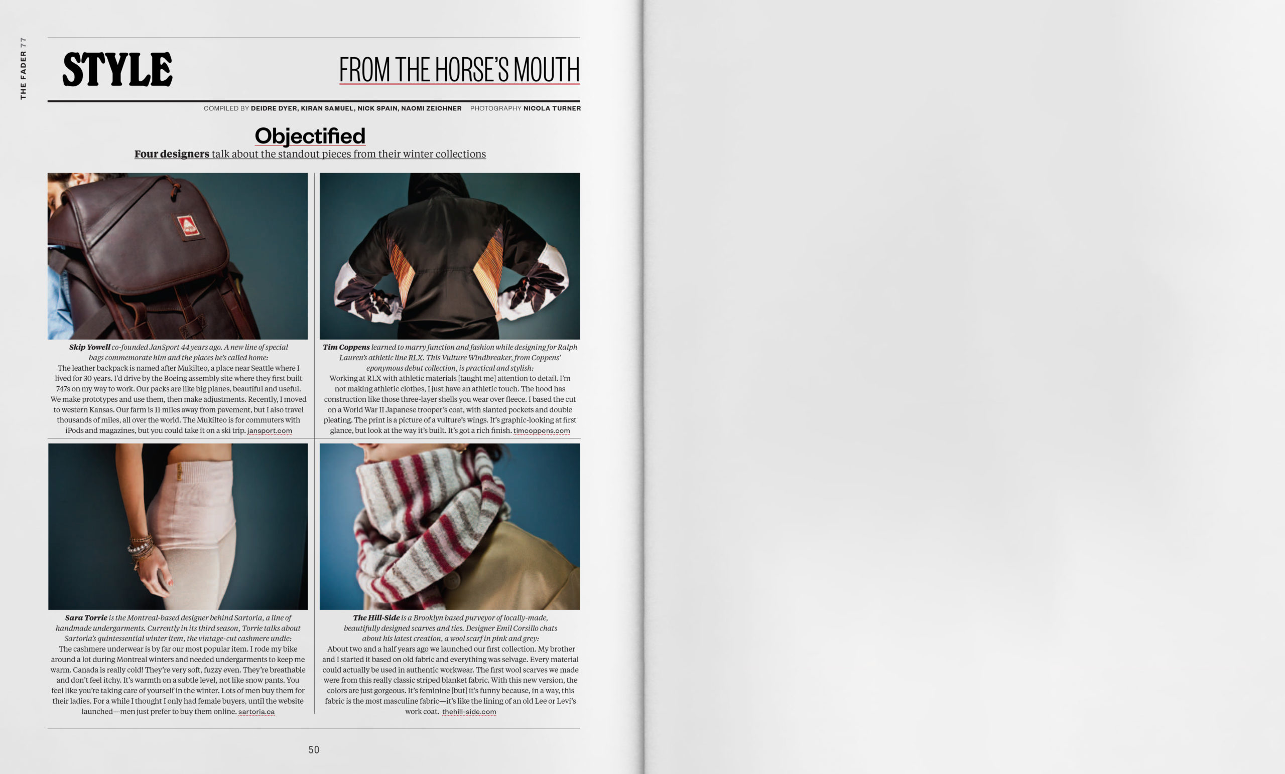
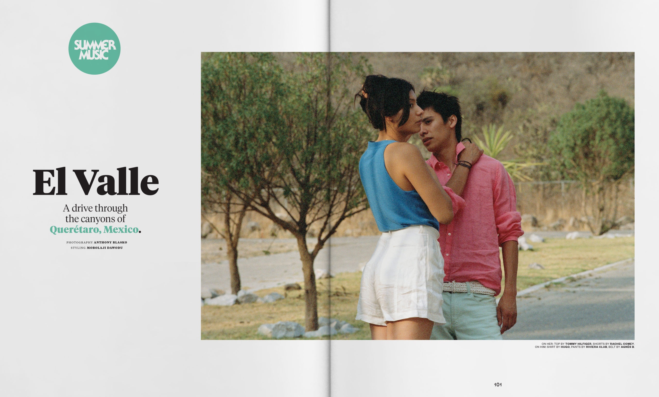
It was a pleasure to be able to collaborate with the ever-talented Mobolaji Dawodu each issue. He brought a unique voice to the way we treated fashion features that helped it to feel organic to the issue concept and the overall art direction voice.

© Justin Thomas Kay 2025