Milwaukee
Bucks
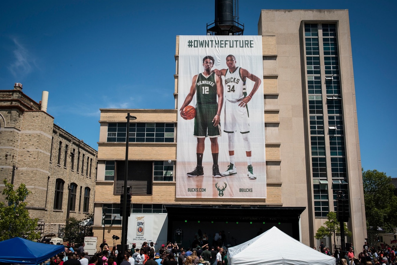
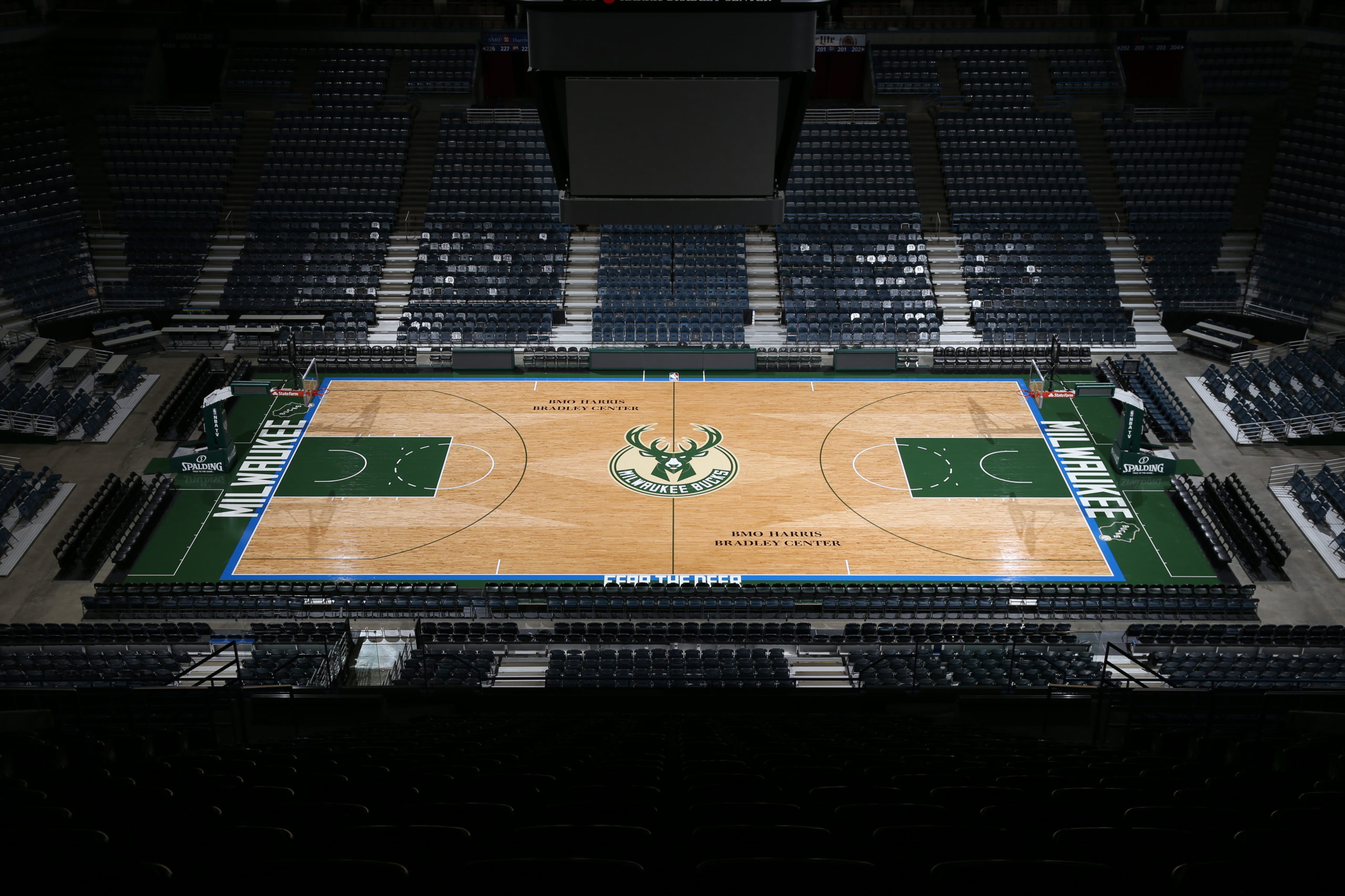
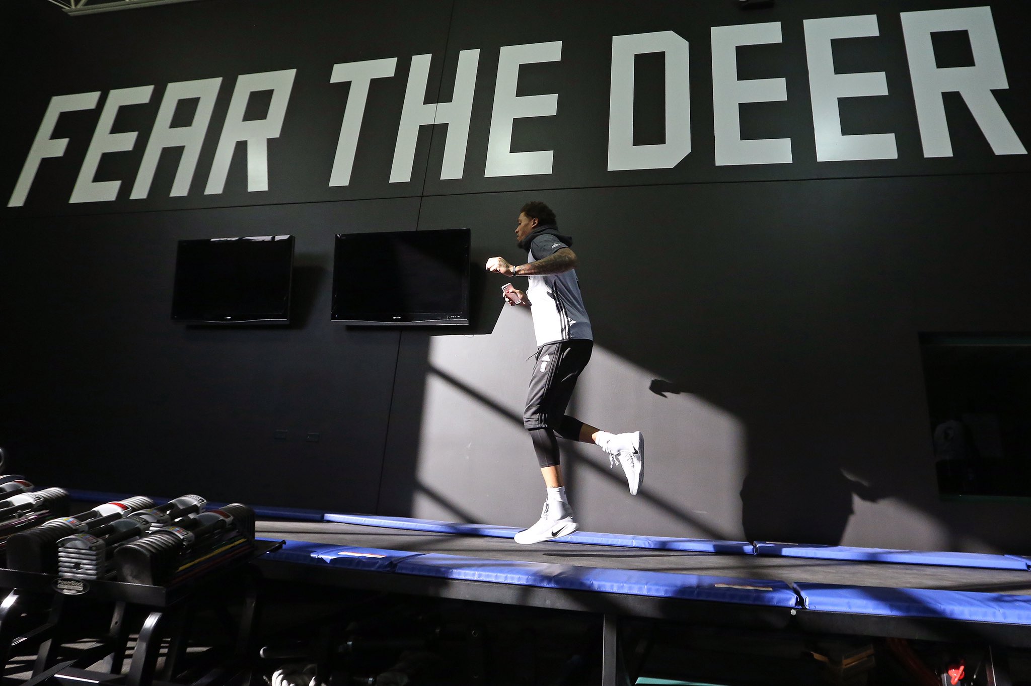
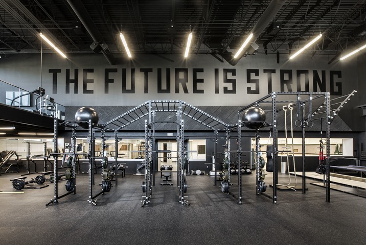
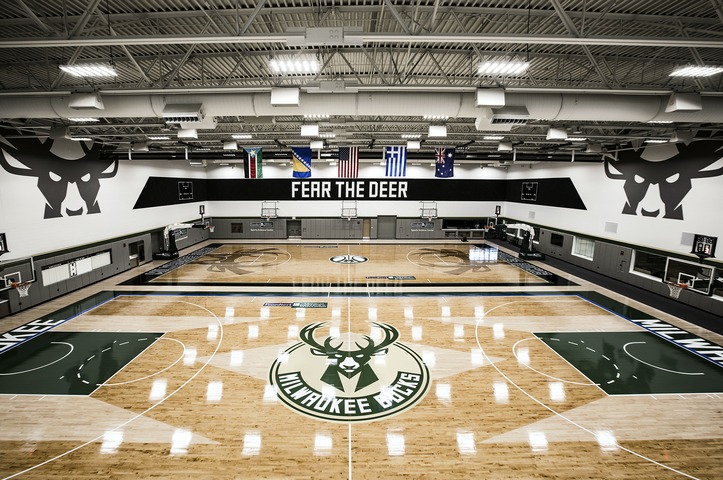
Rebranding for the Milwaukee Bucks. Primary, Secondary and Tertiary marks— translated to jersey designs in collaboration with the NBA, court designs, and a full brand identity system.
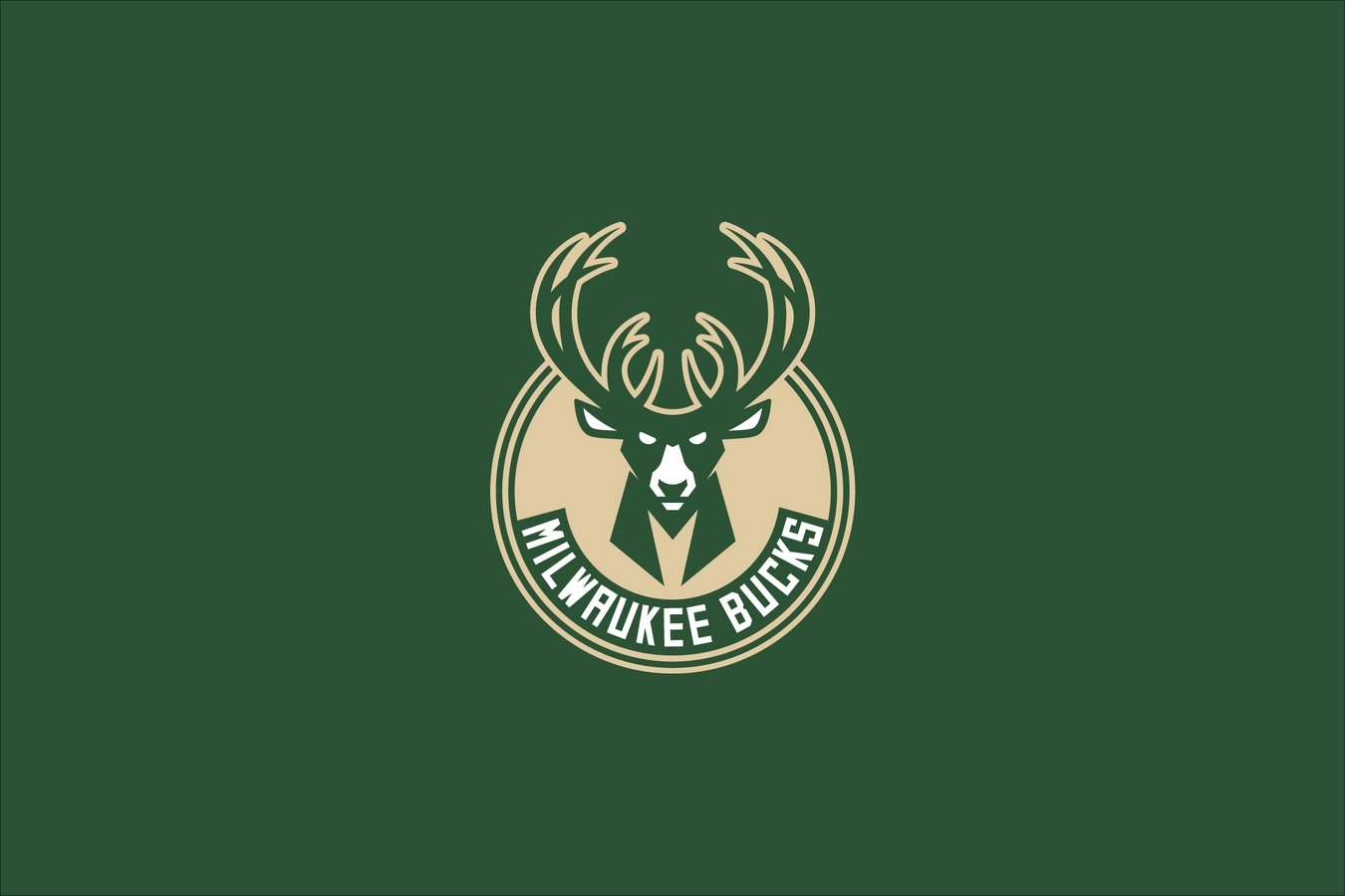
For the primary mark, we redrew the buck motif to better embody the competitive spirit of a team that is fearless (and fearsome), proud, and determined, with its antlers forming the outlines of a basketball.
Established in 1968, the franchise has had a remarkable visual history—it’s the only team ever to have its home court, then Mecca Arena, customized by the artist Robert Indiana. the jerseys worn by Kareem Abdul-Jabaar and Oscar Robertson during their 1970s golden age are all-time uniform classics. as part of their overall quest to return the team to greatness, the new owners wanted to make a clean break with the team's more recent logo marks and red-and-green color scheme.
Working closely with the Buck's front office, led by partner/ECD Kimou Meyer, Doubleday & Cartwright took inspiration from the organization's rich history and the enduring character of its hometown. We introduced an updated color palette—deep forest green to represent Wisconsin’s woodlands, a contrasting cream in tribute to the iconic bricks that define the "Cream City's" architecture, as well as a new accent of bright blue for its abundance of fresh water. Unifying all the elements is a custom typeface, MKE Block Varsity, inspired both by traditional varsity lettering and Milwaukee's industrial heritage.
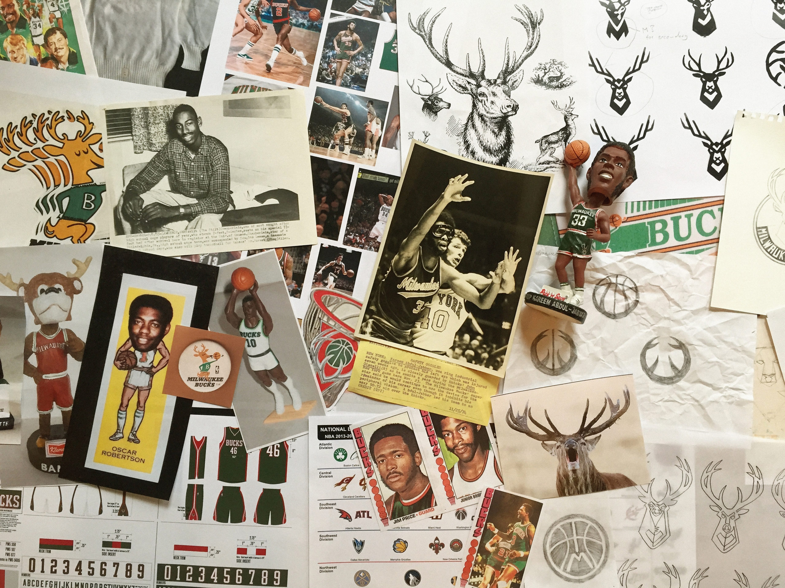
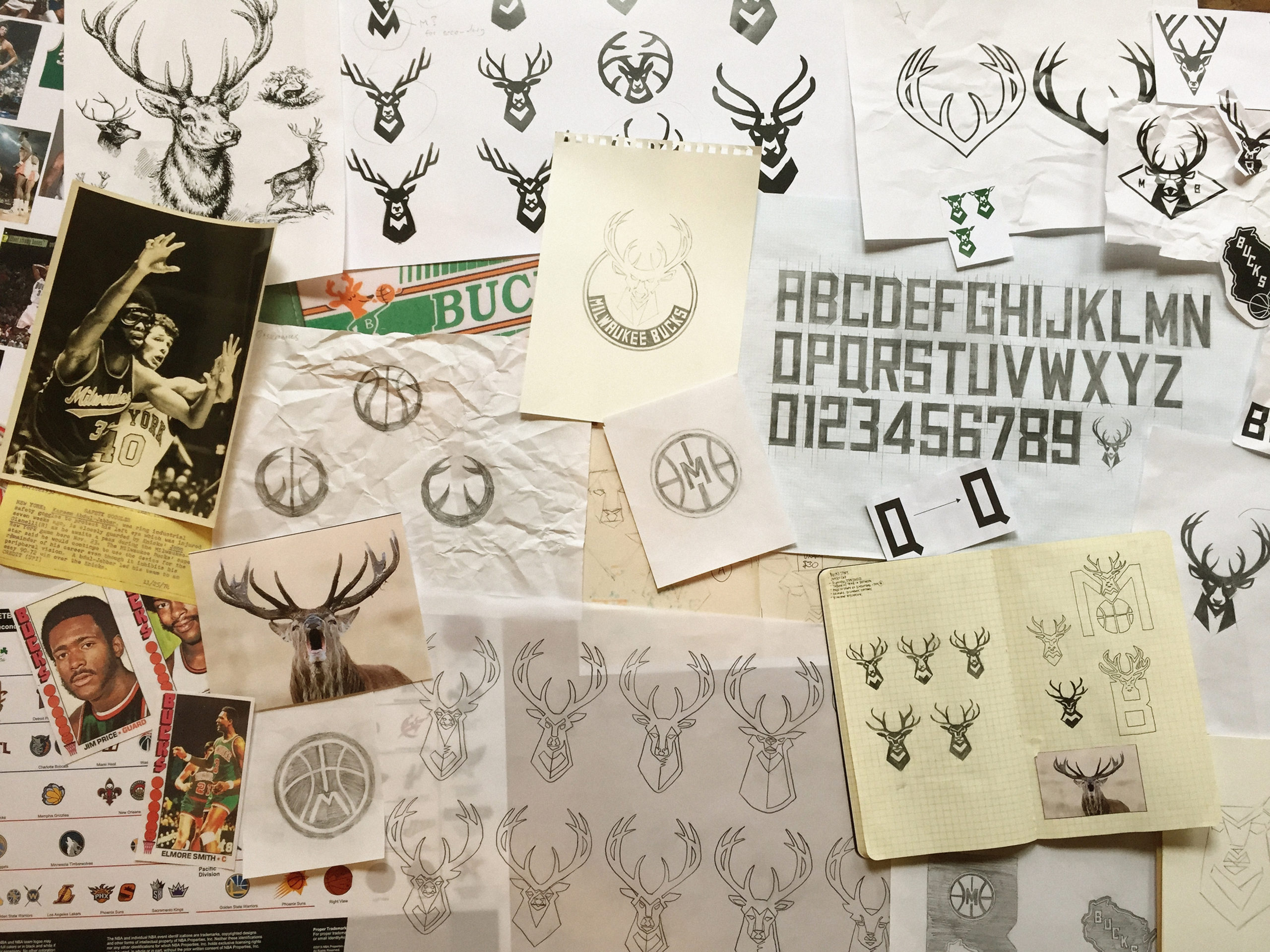
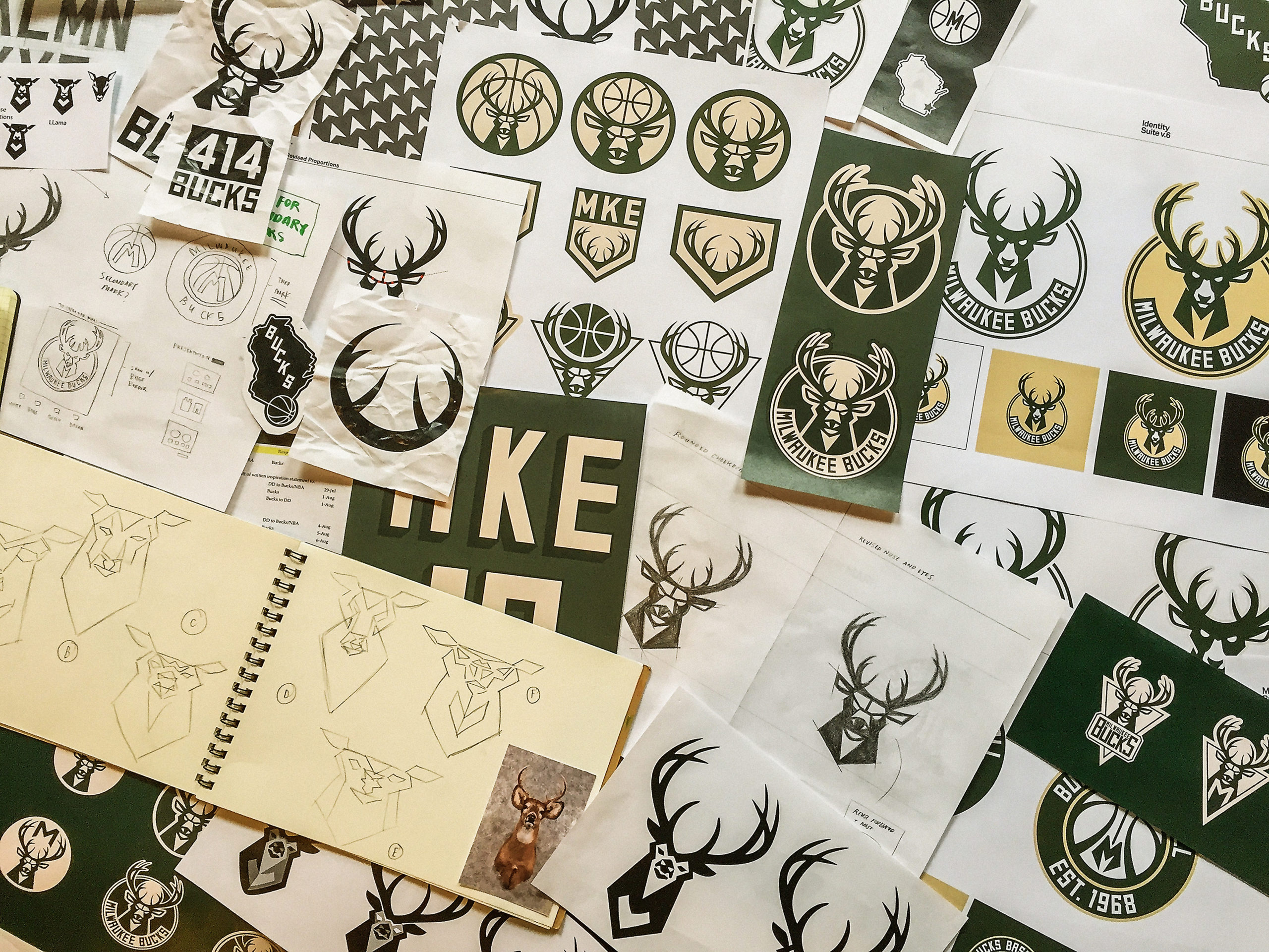
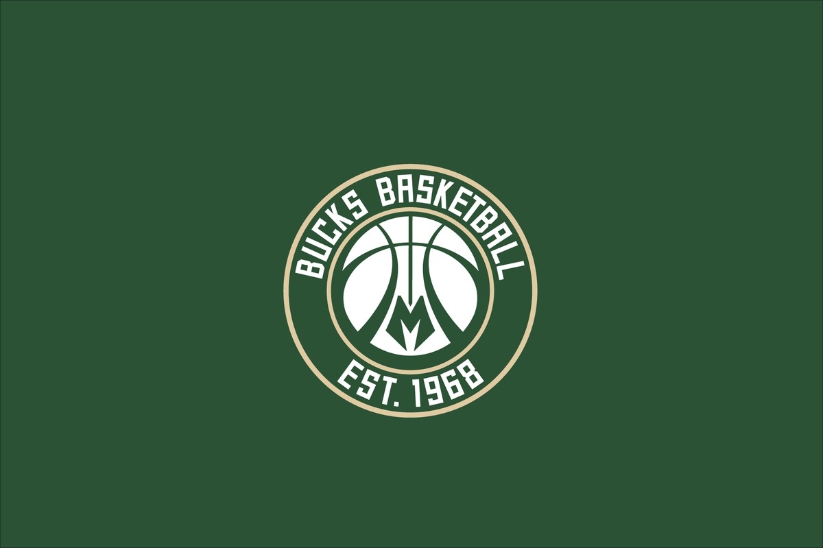
The secondary mark centers on a graphic reduction of a basketball, with a formal reference to the antlers in the primary logo, and a bold letter M for Milwaukee.
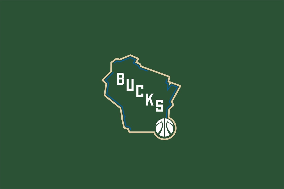
The tertiary mark puts the Bucks at the heart of the state of Wisconsin, literally and symbolically.
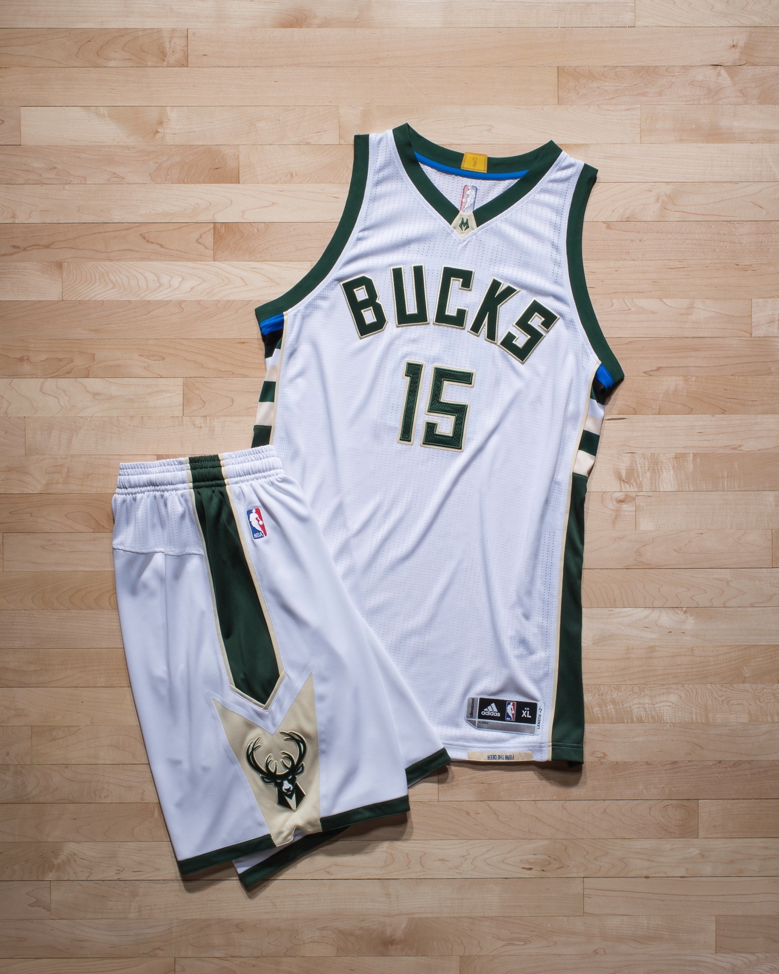
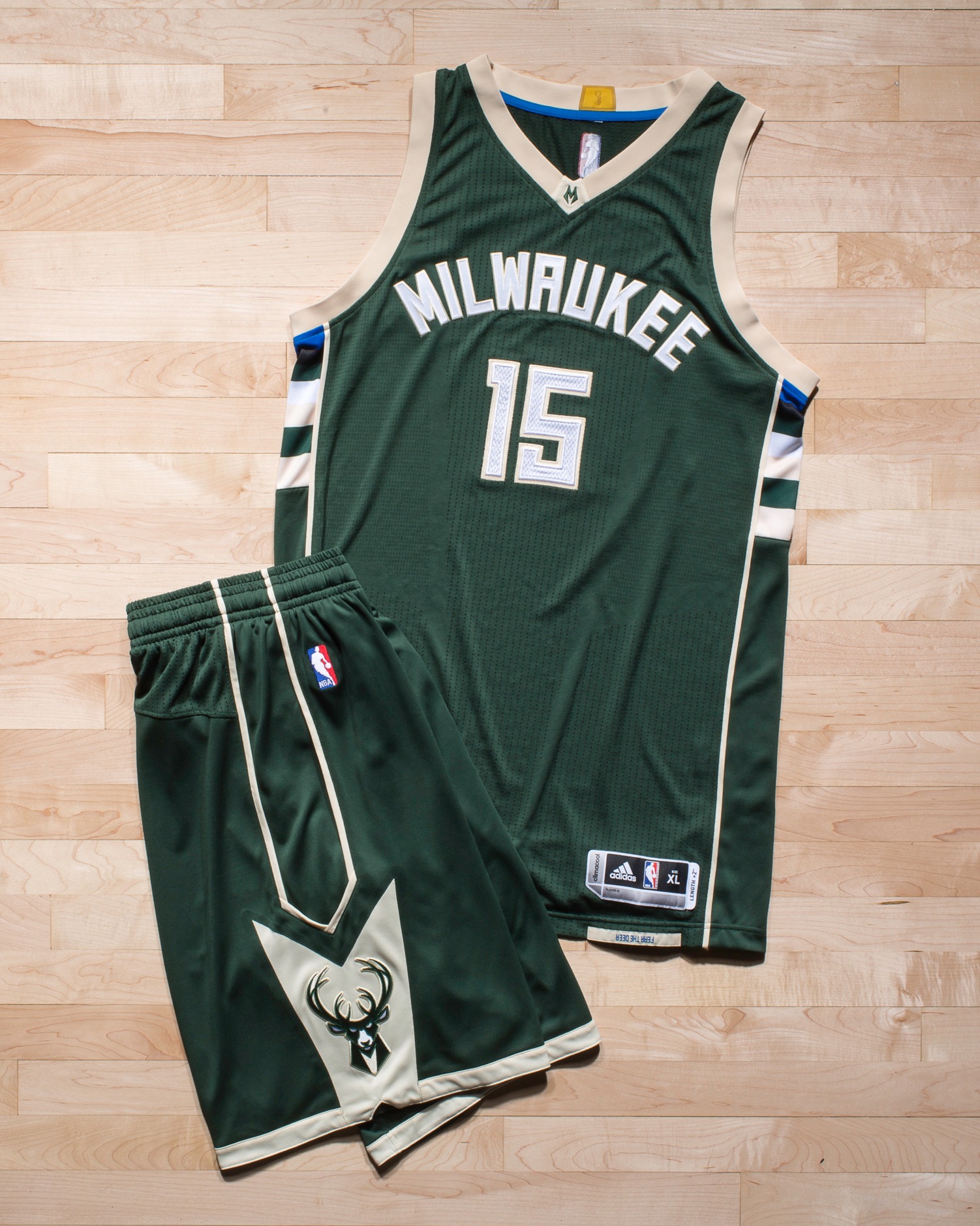
The identity was conceptualized with the jerseys as the primary use. We reintroduced the "Irish Rainbow" and implemented the custom typeface throughout.
© Justin Thomas Kay 2025
